A quick shout out for the Parisian jewelry-maker who dreamt up these Rainbow Links, carried at the new lifestyle store on Abbot Kinney, The Piece Collective.

This one’s made of rose gold and wound in neon cotton thread, but pay them a visit over in Venice—they’ve got a variety of base metals and styles at The Piece Collective. In addition to the goods the store carries, the space itself is pretty covetable, with an awesome, bright yellow angular design on the facade and a calming, zen-like interior. According to TPC:

“We are a lifestyle concept store with an emphasis on the curation of product that we offer here. We carry a collection of fun and innovative ‘gift items’ that includes homeware/decor, accessories, apparel, and really any objects that are both innovative and aesthetically stimulating to us. The overall idea is that a customer gets to experience each product individually as they walk around the store but are also moved in some way by the collection of objects as a whole, giving light to the concept and name of the store, ‘The Piece Collective.'”

Akin a bit to NYC’s Kiosk—which we wrote up so long ago—in the sense that they’re presenting curated content with a narrative. Just much more sunny + beach in TPC’s case.

The Piece Collective is located at 1629 Abbot Kinney Boulevard in Venice. You can follow their visual adventures via Instagram.

thepiececollective-ext

thepiececollective

IMG_9216

If you happen to be in the LA area this week, drop what you’re doing and head to Blum + Poe in Culver City right now.

The gallery is currently wrapping up a solo exhibition by one of our all-time favorite pop artists, Yoshitomo Nara. We’ve written up Nara in this space before, and have seen shows of his in the past, but this one not only displays works in new mediums for the artist, it also serves to encompass the history and evolution of Nara as an artist.

Yoshitomo Nara debuted stateside with his first US show at Blum + Poe way back in 1995. This exhibition, which closes Friday, marks his seventh with the gallery and includes new, never before seen paintings; large-scale bronze sculptures (a new venture for the artist); a white fiberglass teacup fountain, fueled by the tears of a stack of cute, sad heads; and a survey of over 200 drawings from Nara spanning his career.

The new paintings especially impressed us. They’re recognizably Nara’s—cute, sad, anime-like with large eyes and large heads, and peppered with oddly disjointed, edgy text—but many, especially the portrait paintings, now show off a detailed, multi-colored dappling reminiscent of refracting light, especially with the hair + eyes.

Again, the show ends Friday, so do everything you can to get there post-haste!

Below, shots from the show, each of which can be clicked on for a larger view.

Photo of Yoshitomo Nara in 2012 at the Yokohama Museum of Art by Satoko Kawasaki for The Japan Times.

IMG_2946

IMG_2959

IMG_2944

IMG_2963

IMG_2975

IMG_2976

IMG_2969

IMG_2968

IMG_2950

IMG_3007

IMG_3004

IMG_2999

IMG_2997

IMG_2995

IMG_2992

IMG_2981

IMG_2979

IMG_2987

IMG_2937

IMG_2938

Dutch photographer, Ellen Kooi, creates theatrically tinged images that act as a window into a fairy tale world we never knew existed. Rather than present a finished idea or definitive narrative, each of her scenes has mystery inherently woven throughout, pulling viewers in repeatedly in futile efforts to solve the unsolvable.

Kooi first plans her photographs out in detail with prep sketches outlining her set design and subjects, treating the landscape like a stage. She then brings in lighting rigs and shoots the scenes during daylight hours with large format camera, giving the photos an eerie, otherworldly feel that effectively straddles the line between fantasy and realty. The end result are images that strike the viewer as oddly haunting and dangerously beautiful all at the same time. 

Most are taken in the countryside around her home in Haarlem (insert Harlem joke here)—drawing from the often frigid-looking, barren environment—and the title of each piece is usually drawn directly from the name of its location, emphasizing close ties between landscape and subject. Above, Langerak – Blauwe Boom (2014)—which translates to “Langerak – Blue Tree”—uses a saturated palette and devotes a small portion of the visual real estate of the image to the subject, keeping the viewer coming back again and again to more fully examine the scene.

A native of Leeuwarden in the Netherlands, Kooi has exhibited throughout Europe + the states and currently has a show on view at the Galerie Les Filles du Calvaire in Paris, France. NYC—you can see recent work of hers tomorrow through Sunday at P.P.O.W.‘s booth at The AIPAD Photography Show (Booth 125), located at the Park Avenue Armory (643 Park Avenue). The show’s open to the public—tickets are $30 for regular admission, $10 for students with ID.

You see more of Kooi’s work on her Web site (click ‘ICONS’—it’s the better navigation).

Above: Langerak – Blauwe Boom, 2014
C-print mounted on plexi and museum board
35 ½ x 67 inches
Courtesy of the artist and P.P.O.W Gallery, New York

Below: Oosterplas – Reflection, 2012
C-print mounted on plexi and museum board
39½ x 36 inches
Courtesy of the artist and P.P.O.W Gallery, New York
EllenKooi_Oosterplas-reflection_argb_groot

This looked like art to us.

We’ll call it “Drying Shoes”.

This track hit our inbox this morning and we’re suddenly obsessed with it.

“XXVII” is the first official release of NYC-based Camille Corazón—solo electronic artist, bejeweled napper, and—we’re guessing—part-time model. Jest as we will, this song’s awesome and we hope it to be an accurate bellwether of musical excellence. Give it a go:

NYC—catch Corazón live at Gina Martynova‘s solo exhibition  7PM Thursday night, at BRISTLE + CRÈME—416 Third Ave + 30th. RSVP to rsvp@bristleandcreme.com.

We just did shoot for the spring 2014 line of NYC-based vegan shoe makers, Novacas—house brand of vegan shoe store MooShoes.

There are a lot of not-so-great faux leather shoes out there, but Novacas has been steadily improving the quality of their product and materials every season and this new batch of shoes seems pretty awesome. What’s more, they manufacture their shoes in worker-freindly factories in Portugal that pay fair rates to their shoe-makers rather than relying on cheaper labor elsewhere.

You can see a sample of the new shoes and shots below and over at the MooShoes Web site.

MooShoes_8998

MooShoes_9042

MooShoes_9129

All of us grew up knowing that National Geographic went hand-in-hand with powerful, evocative photography. It was a given that, when you sat down with that distinguished publication—framed as it still is in that bright, nearly shouting yellow—you were likely to open to any random page and have your breath taken away by what you saw. Whether I realized at the time or not, the magazine helped teach me the power images hold over us all.

But, evidently, that wasn’t always the case. When National Geographic was first published in the fall of 1888, it was a dry, severely text-heavy scientific publication that served as the sole literary outlet for the National Geographic Society. But, after a resoundingly positive public reaction to full-page photos of Tibet in their January 1905 issue, the magazine made a dramatic + deliberate shift toward the graphically impressive, pulling in photographers to create compelling images to accompany the stories that filled its pages, which had grown from discussing optimal slope grades for water runoff (yes, made that up) to tackling larger environmental, political, and societal issues.

Last fall, National Geographic + LA’s Annenberg Space for Photography opened The Power of Photography: National Geographic 125 Years. Yes, I too wish they had included a little more punctuation in that title, or maybe a preposition, like ‘at’, but that’s all beside the point. The point: Go to this show before it closes.

I’ll admit straight away, when I first heard about the format of the exhibit, I had my misgivings. You see, given the vast, vast collection of outstanding photographs that were to be part of the exhibition, organizers made the choice to rely on photographic slideshows shown on digital displays. Sounds budget, right? Turns out, it’s awesome, in the most literal sense of the word.

Sarah Leen, Director of Photography for National Geographic, explains:

“National Geographic’s photographic archive spans 125 years and includes more than 11.5 million images. In order to truly capture the breadth and depth of the collection we decided to create a show with 501 images alternating on screens, along with a selection of prints and print mosaics. The result not only reflects the general move in photography and the magazine toward digital imagery, but allows for a dynamic, immersive and richer experience of our archive of photographs.”

The Center’s site further explains the set-up: “Thirty professional-grade large format LED monitors are arranged to create video walls throughout the Photography Space galleries. These six video walls, ranging from 12 to 14 feet in width, present both individual images and photographic essays. Given the volume of photographs on the screens, and a format in which the images loop at different times throughout the galleries, the viewing experience is unique to each visitor and each visit.”

The result is honestly a must-see for any fans of…everything, really—animals, nature, people, culture, beauty, color, and that amazing feeling you get looking up into space or out at the ocean when you realize that your problems are usually the smallest, most insignificant things in this vast, limitless world of ours.

Seriously, if you live in LA or are visiting in the next month (the show closes April 27)—go. You’ll see what I mean.

The Annenberg Space for Photography is located at 2000 Avenue of the Stars, Los Angeles, CA 90067 and is open 11AM-6PM Tuesday-Friday; 11AM-9PM on Saturday + Sunday; closed Mondays. Parking is available in the underground garage next-door (there are signs).

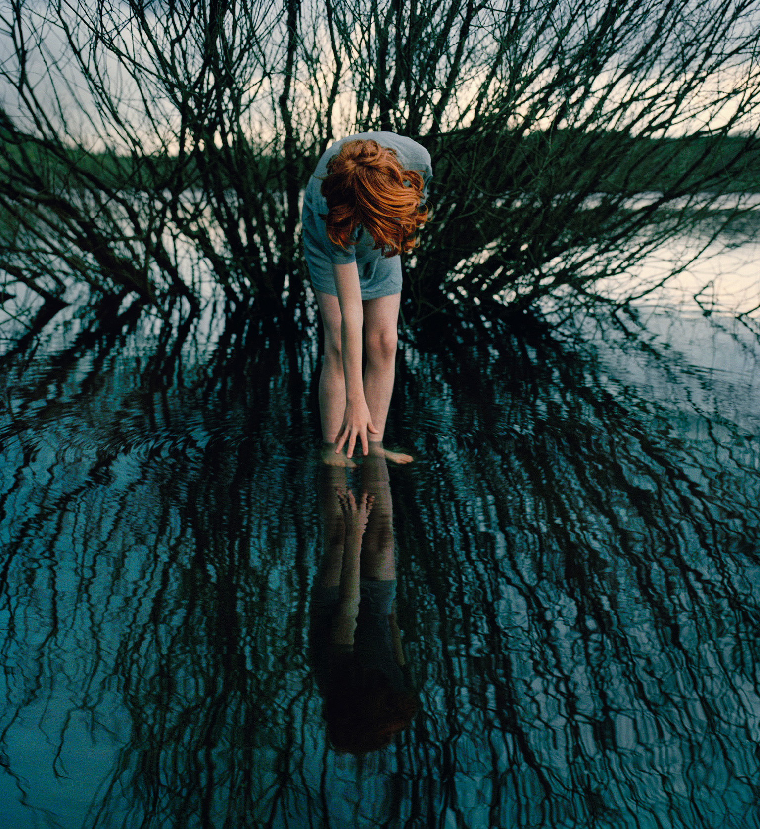
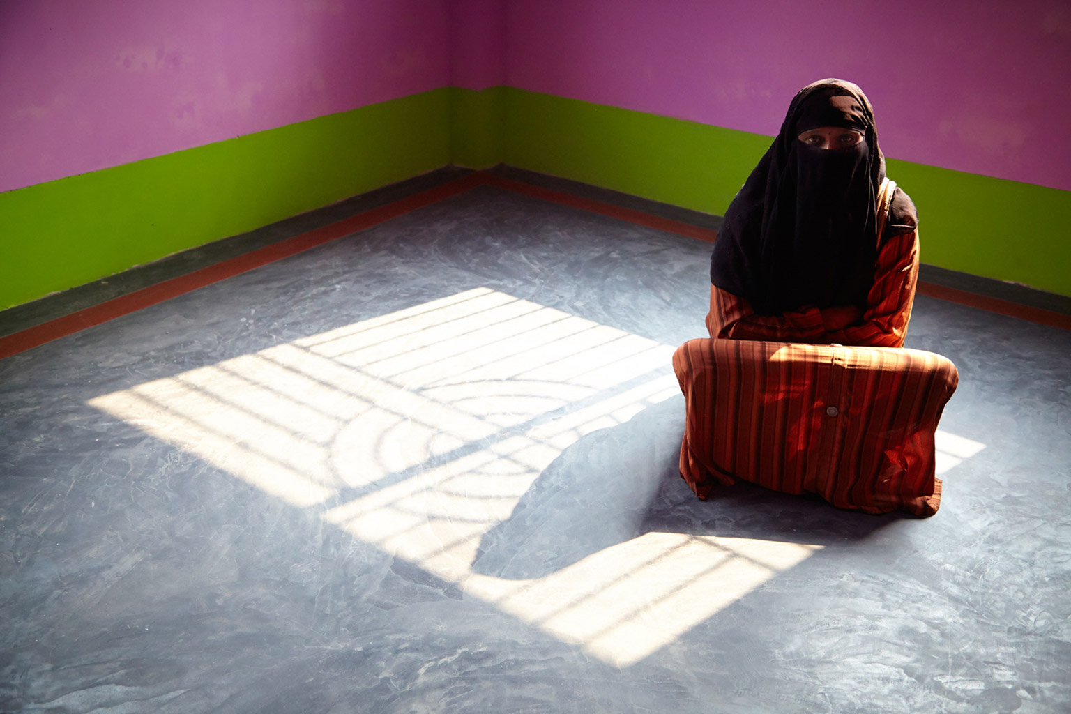
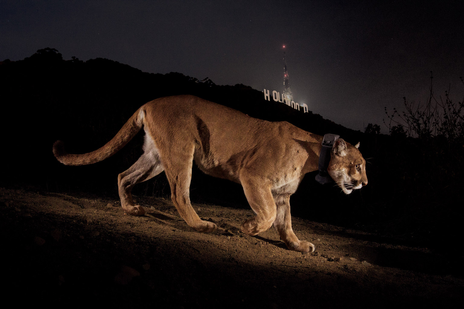
Above, the much-circulated photo wildlife photojournalist Steve Winter took last year of P22, the cougar that lives a short walk from our studio; a fact that both impresses us…and terrifies us. To the right, Steve McCurry’s iconic photo of an Afghan refugee from 1984. See both in person at the exhibit.

Below, a short video featuring photographers from the exhibit.
 

Katie + I first met at a college student activities night in the fall of 1995 over the student environmental group’s recruitment table. So activism—especially in the realms of the environment, animal rights, and feminism—has been at the root of our relationship from its very beginnings.

Which explains the soft spot our studio has for non-profits doing good work in these realms.

One such group was California-based Feminists for Animal Rights , started in 1981. The organization expanded to a national level of activity in the years subsequent to its founding and remained active well into the 21st century, working for over two decades to end all forms of abuse against women, animals, and the earth. From their Web site:

“FAR’s major focus from its inception was on consciousness-raising—in the feminist community, in the animal advocacy movement, and among the general public. FAR sought to shine light on the connections between the treatment of women and animals under patriarchy….

FAR was not, however, just an organization with members and a mission. It was a network of women striving to live cruelty-free lives. They were committed to promoting veganism because they believed in the feminist precept that the personal is political. They knew that it was not enough to claim an abstract respect for animals; they knew they must embody that respect in their daily lives. These women advocated veganism because they thought it was desirable to work towards the elimination of all products derived from or tested on animals—in our food, clothing, household and other products and supplements.”

We were first approached to create an archival, memorial site for the no-longer-active group in 2011 by the group’s founder, Marti Kheel. The goal was to keep the legacy of the group and its mission alive while creating a resource of the articles written by the group’s member through the years. Early in the process though, Marti sadly passed away after a battle with a form Leukemia. Her sister, Jane, stepped in to finish the project for her sister, working with us to create a fitting tribute to her sister’s lifetime of work.

We took FAR’s original logo—which was relatively small and difficult to use at larger impressions without growing pixelated—and recreated it with vector art, allowing for crisper shapes and the ability to resize as needed without any loss in image quality. We then built a site framework around a watercolor version of the fox in the logo, taking the group’s brand and breathing new life into it for this online tribute. Marti’s sister then took our site files and passed them onto her WordPress developer to build out the site and its content based on our framework.

Visit Feminists for Animal Rights finished site to learn more about the decades of activism + education.

You’ve likely already heard about the documentary, Mistaken for Strangers. It started out as a standard rock-doc on one of our favorite bands, The National, created and conceived of by frontman Matt Berninger’s younger brother, Tom when he was asked to tour with the band in their crew.

But the story of the film—inextricably wrapped up in the relationship between the two brothers—evolved as it was being created by Tom and (skillfully) co-edited by Matt’s wife, Carin Besser. The end product is less about the Grammy-nominated band and more about the younger Berninger growing up in the shadow of his sibling’s success, from grade-school popularity to indie rock stardom.

We were able to attend the LA premiere last night—followed by a live performance from The National—and have to highly recommend the film. It’s smart, funny, and endearing in the end.

Watch the trailer for Mistaken for Strangers below. The movie can be ordered via the Web and iTunes and continues to hit the big screen around the US. New York—the IFC Center picks the movie up Friday. Check the film’s site for screenings elsewhere.

Above, Tom + Matt in our ‘hood, Beachwood Canyon! To the right, shots from our friend, Maureen Hoban, as Matt + Tom entered the audience during an encore and (awwww) hugged last night.

Below, a recent interview with Berninger the elder from Brian Ives at radio.com on Mistaken for Strangers, indie going mainstream, and the Grateful Dead tribute album the band is curating.

Yes. You read that right.


It’s that time of year again—when normal, relatively sane sports fans go…MAAAAAAAAAD.

For us—long-time not-basketball fans—it should mean missing out on all this fevered bracket work and yelling at the TV. But we very much dislike being left out. So what’s a graphic designer with little to no knowledge on this strange “hand-soccer” game to do? Find something else to scrutinize, obviously; namely, their logos.

We first brought you our Logo March Madness in 2011, when the Longhorns took it all (solid logo). Then, again, last year, when our very own alma mater and proud possessor of one of the worst logos of all time,  James Madison, made it into the playoffs for the briefest of moments.

So, for the third year, and just in the nick of time, we give you raven + crow studio’s MARCH MADNESS VISUAL BRANDING BRACKETS!!!  Click the brackets to the right to see a larger version.

As with years past, our judgments on visual branding and team logos have absolutely no bearing whatsoever on actual games…but we do wish the very best to teams choosing solid branding over, say, weird contorted animals and mid-century script fonts.

wypyv9joaq76f59es93jfgo0gFirst off, we tip our hats to the many schools with newly redesign logos, first and foremost to VCU, who literally debuted a solid new mark days ago, incorporating their mascot (the ram) in a nice, subtle way in the V of the logotype. Also redesigned last year, UCONN’s logo which used to look very much like a dog our dog would like to hump (to the right)—such flowing locks; and that tongue! The San Diego State Aztecs ditched the old-school gold outline and went with a more up-to-date, flat design and a slightly more square layout—we highly approve the more useable logo. And the Creighton Blue Jays—awesome. That bird looks badass. And he used to look like an angry nerd.

So, in most cases, our take on sports logos is that they tend to be too sports logo—too much angry animal; too ‘shiny’; too EXTREME. Beyond that, our thoughts on what make a good sports brand mirror what we think makes for a good brand for anyone—keep it simple, don’t try to jam too many ideas or too much text in there, be unique, and be compelling. One exception that made it further than it likely should have—the extra-EXTREME New Mexico Lobos. They just kept going up against nearly equally bad logos.

So, after an initial bout with—what, an HP Lovecraft-esque rooster?—our winner, the University of Virginia, proves that a clean, simple  logo with both a refinement that points back to their scholarly origins and a sports-appropriate level of edginess is a perfect fit for a university athletic team. Well-done, UVA.

Let us know what you think on our Facebook page, where we’ve posted the brackets as well. And good luck, everyone!