Let me just say, this is awesome.

Just before the release of their new album (which we wrote up recently), Sleater-Kinney was interviewed by one of our new favorite comedy duos, Abbi Jacobson + Ilana Glazer of Comedy Central’s Broad City.

The panel discussion took place in New York City’s Ace Hotel in front of an intimate crowd of 150 or so lucky souls and clocks in at just over an hour, all of which is worth watching.

Oh, to have been in that room. But we’re all runners up thanks to NPR, who shared the videotaped Q+A with Carrie Brownstein, Corin Tucker, and Janet Weiss last week, embedded below.

As NPR put it: “The mutual respect onstage was unmistakable: When Glazer and Jacobson insisted that Broad City wouldn’t exist without Sleater-Kinney, Tucker replied, ‘When we watch your show, I want to write a song.'”

We’re trying out a little bit of Web synergy today, so after you watch this interview, head over to Forgotten Favorite, the music journal we started with Pel, to read our retrospective on Sleater-Kinney and hear their relatively ancient cover of Boston’s classic “More Than A Feeling”.

This just in—David Byrne’s new project is a color guard. No joke.

As the artist informed his fans this morning, some years back, a color guard team approached the artist about using some music he’d written for theatre piece in their routine.

His response—“Fine, no charge… you are a high school team after all,” asking that the team send through some sort of documenting of the finished product down the line. When they did, he “watched, and was amazed and delighted to find myself in a new world that I didn’t know existed.”

He continues:

“Over recent decades, the teams have evolved into something strange and wonderful; they’ve created a vibrant, innovative and original vernacular artform that is wildly popular across the whole North American continent, but is all but unknown in many of the big urban centers—like New York, where I live. Contemporary Color aims to remedy that situation.”

You can read his full announcement for more, but, the take away for you—David Byrne’s doing color guard-based performance accompanied by him and the likes of Nelly Furtado, Kelis, St Vincent, How To Dress Well, Devonté Hynes, Nico Mulhy and Ira Glass, tUnE-yArDs, and who knows what other awesome artists.

The only performances announced so far are June 22 + 23 at the Air Canada Centre in Toronto and at Brooklyn’s Barclays Center on June 27 +28. Click the link to the original message from Byrne above for pre-sale codes.

Tickets for the Brooklyn show went on sale today and were still available at the time of writing.

And get ready for what I can only assume will be a rising trend of color guard-based popular entertainment.

Can’t wait for their version of Pitch Perfect.

We won’t be posting an inspirational photo of Dr. Martin Luther King, Jr.’s with a one-line snippet of a massively inspirational, cultural-shifting speech he once gave or—god forbid—superimposing such a quote over a dude who just won a football game.

We will, however, be posting this badass photo of him in Chicago schooling local civil rights leader Al Raby in a game of pool.

After such a tumultuous year, I feel like we could all use a little inspired levity.

Wishing a most giving, kind, productive Martin Luther King, Jr. day to you all.

Another year, another set of coffee labels for Pel‘s annual New Year gift to clients. This year, Paul + co. have teamed up with Manhattan’s abraço—one of Paul’s favorite coffee shops—to create two exclusive custom blends—the Butterfly Blend of Columbia + Java and the Kenya AA Lanana + Rwambiti.

Last year, we designed labels for Pel shortly after creating the company’s brand, incorporating an illustration we made of a coffee plant and the colors of the there countries of origin.

This year, we explored a couple of different design directions, but ended up going with Paul’s original idea of a pattern made up of “angular tesselating colored triangles” and two different color palettes for the two coffee blends.

Check out Pel’s work—both in partnership with us and solo—on their Web siteabraço‘s located at 86 East 7th Streetin Manhattan if you’d like to try out their held-in-high-regard coffees.

(Sung in the style of the Shaft theme song)

Who’s the gothest candle
anywhere in town?

This one!

Alright, not my best musical analogy. But how goth is this candle‽ Super-goth is the answer.

But/and it’s also awesome. Not only are the black on black aesthetic and the container shape both pretty stellar, but the scent—Gunpowder Green Tea—is excellent.

Hand-poured in Brooklyn, NY by Joya Studio, the finished product’s a collaboration with Nashville-based ceramic artist Sarah Cihat and “features notes of shiso tea leaf, white mint, cape jasmine, calla lily and Sicilian lemon.” So, yeah, a candle you want to eat, but also one that calms the nerves and gets you nice and cozy on those chilly winter nights.

And yes, it does get chilly at night in southern California.

Kind of.

We got the candle at Brooklyn’s Article&—a favorite Cobble Hill boutique of Katie’s. You can order it online from them or directly from Joya, who has quite a nice selection of candles and the like.

Owen seemed to have think that his feet trump mine in this outtake from the Novacas photo shoot we did the other day.

We’ll post more on the new lookbook we did for them soon.

We’re happy to announce yet another collaboration with creative collective Pel (wrote up some other work we did with Pel a while back, including that Web site). This one’s less heavy or serious than our usual work together but, nonetheless, it’s one that’s close to both our hearts and that of Pel principal, Paul Signh.

A while back, Paul ran a music blog named Forgotten Favorite that endeavored to share with the world rediscovered classics (at least ten years old).

Now, so many years later, Pel and raven + crow studio are partnering up to bring Forgotten Favorite back to life.

The site’s namesake is “My Forgotten Favorite”, a song by seminal noise pop band and common favorite between us, Velocity Girl. The song also serves as the inaugural post by Paul. I follow it up with one of my all-time favorite bands, Huggy Bear.

We created the new design and site branding, pulling the color palette directly from the 1991 Slumberland single for “My Forgotten Favorite”.

You can read both write-ups and listen to the songs over at Forgotten Favorite.

Paul + I will be regularly posting new…old songs to the site and employing friends and fellow lovers of music to write up their own forgotten favorites, so stay tuned!

forgotten-favorite

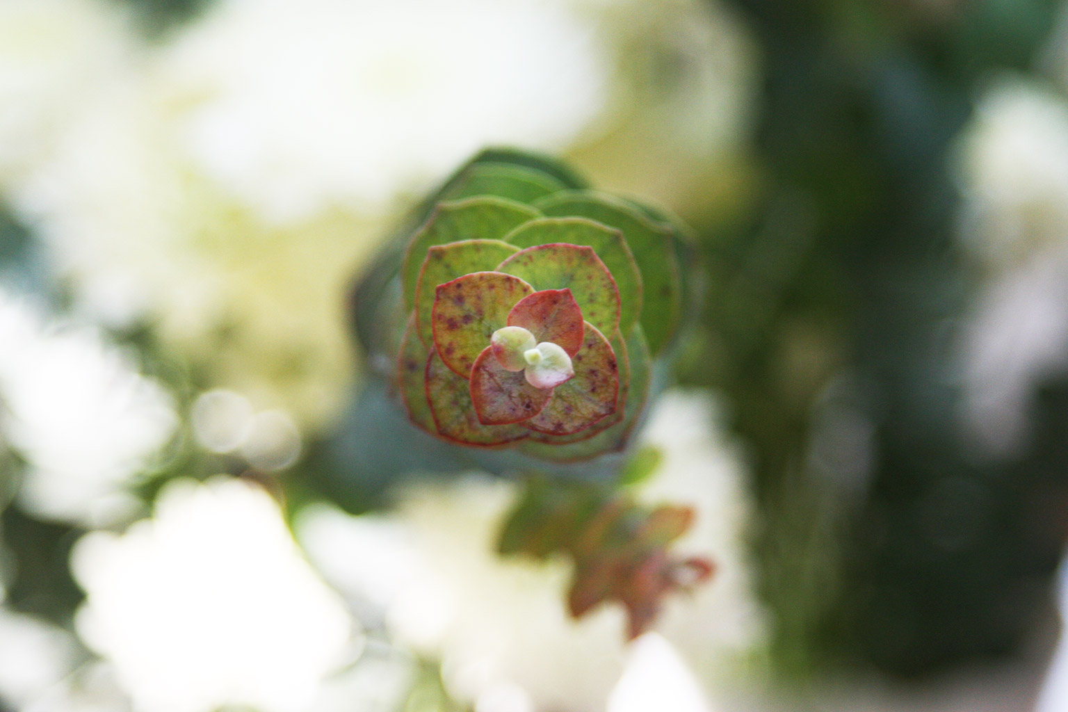
Though it’s far from native to Southern California, we’ve noticed, since moving to Los Angeles, that eucalyptus can be found far and wide in LA and neighboring vicinities.

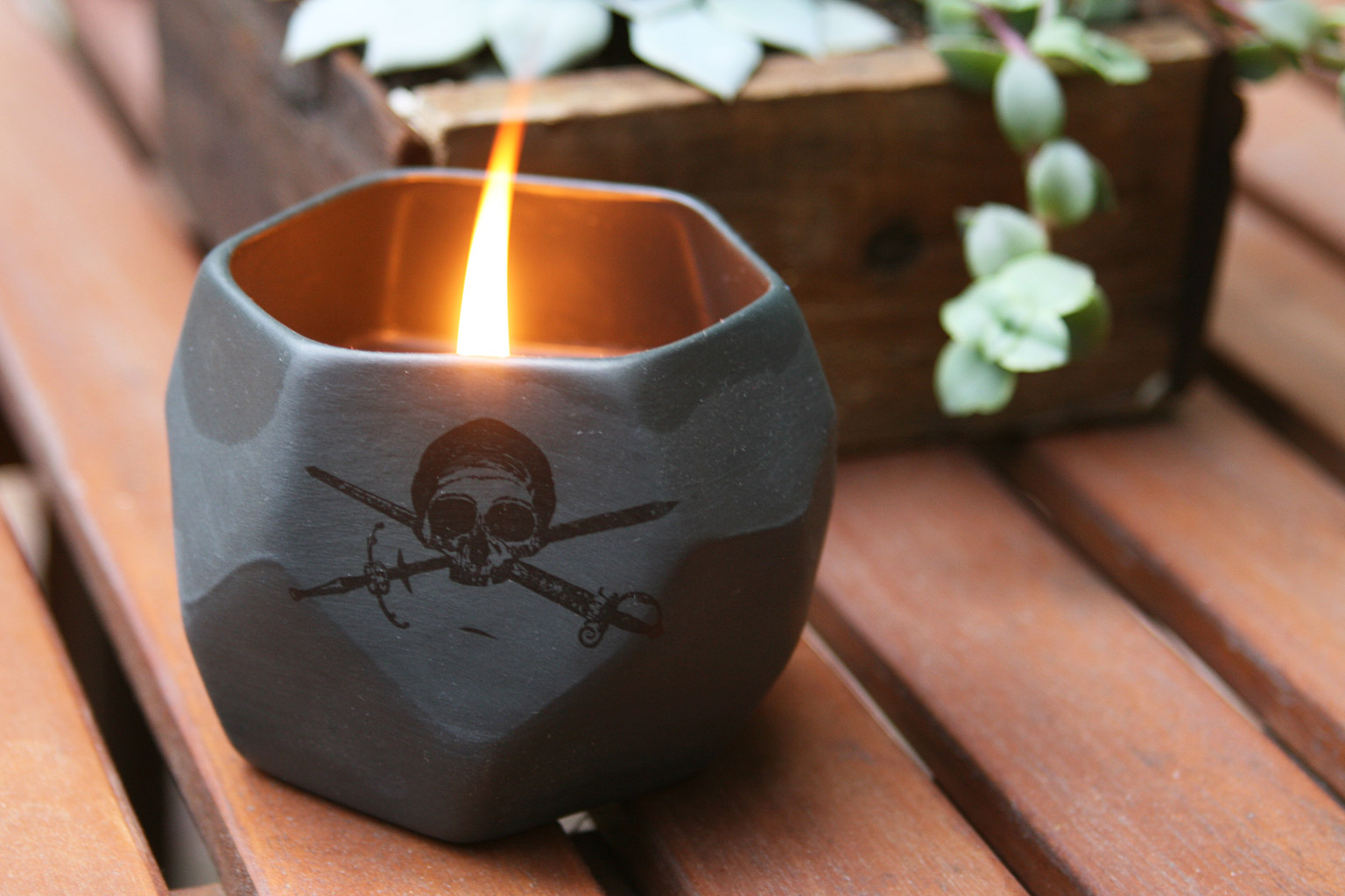
We’ve been personal fans of the tree/plant ever since that scene in season 1 of Lost when Sun helps Jack treat Shannon’s acute asthma by grinding up eucalyptus leaves. Eucalyptus oil has long had various practical uses, from acting as a solvent to a deodorizer to an insect repellent to an antiseptic. But initial research—and some empirical evidence from non-western cultures—shows the oil may also help to break down mucous in airways, allowing for easier breathing for sufferers of asthma.

Katie’s had asthma her whole life. When we were back in Brooklyn, the winters were especially tough, with both the frigid air outside and the reduced air quality indoors due to traditional steam radiators and (we think) the layers of lead paint on them. In addition to buying commercial eucalyptus oil at supplement stores, another thing we liked to do to stave off asthma attacks and, generally, promote better breathing, was to buy some freshly cut eucalyptus from the farmers’ market or flower shops, bundle it in twine, and hang it in our shower under the shower head. The resulting steam from a hot shower allows the oils to be released and, as an added bonus, gives off a pleasant scene to start your day.

Now that we’ve relocated to Los Angeles, we’ve noticed the tree—native to Australia—growing abundantly around town, evidently largely due to the efforts of famed tobacco tycoon, state forester from 1886-1888, and eucalyptus-lover Abbott Kinney. Better known as the developer of Venice, Kinney also championed the many potential uses of the plant in his time—chief among them, landscaping to shield from high winds and abundant erosion.

The tree enjoyed a massive boom in LA-area planting when projections were made about the fast-growing tree as a source of timber in hardwood-short times. Though the wood turned out to be unsuitable for that purpose (it evidently grows brittle, cracking and twisting as it dries), we’ll take the more medicinal and decorative aspects of the plant as welcome ones in our daily lives. Makes for some nice impromptu photos too.

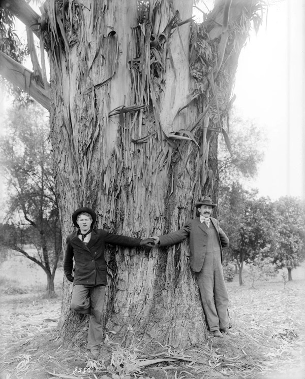
Read LA writer Nathan Masters’ article “Who Eucalyptized Southern California” to find out more about eucalyptus’ history in Los Angeles. Below, from Masters’ article, “Two men demonstrate the girth of a 25-year-old eucalytpus tree on the L. J. Rose ranch in Rosemead, circa 1900.”, photo courtesy Title Insurance and Trust / C.C. Pierce Photography Collection, USC Libraries.

Eucalyptus

Almost three months in to our new role as Creative Directors and show runners for MooShoes Los Angeles (sorry—the city’s shop talk has finally started to sink in), we’ve created a set of four prints + matching stickers that pull some of the illustration and hand-lettering work we did for the store wallpaper, all of which are now available for sale in the LA store, the NYC store, and at mooshoes.com.

The prints were printed locally in Los Angeles at an environmentally friendly, low-waste printer on partially recycled content, heavy-weight paper. We obviously wanted to make sure these were as low-impact as possible and, at the same, end up with a high-quality print on paper that would really do a good job absorbing big blocks of bold color for these.

Once we find a good match in terms of local manufacturers, we’re planning to take the designs and start applying them to some apparel—tees, pullover hoodies, tanks once it warms back up.

In the meantime, fee free to stop by either the Los Angeles or New York store to check the prints out in person or order them online. Below, all four on display individually in the LA store.

be-kind-to-all_4640 respect-for-all-beings_4645 vegan-for-a-better-world_4671 cruelty-free-animal-approved_4657

Creating a color palette for a project from scratch can be challenging without a starting point—some source of inspiration.

Rather than get that inspiration from some algorithm created by design software, we’ve found that it’s often more fun and results in a more dynamic, original product to take cues from the real world, like this salad we made one day back in 2012.

Or this kind of bizarre new-made-to-look-old 8-bit video game, Shovel Knight, in which a brave and valiant knight uses his chosen weapon—a shovel—to fight hordes of evil denizens to make it to his beloved missing partner, Shield Knight.

Our friend Justin introduced us to this game when we were in New York recently and we took a quick shot of this scene of Shovel Knight resting fireside under a setting sun. We totally loved the colors chosen for this 8-bit artistry—well done Yacht Club Games.

For the record, we’re terrible at Shovel Knight. We’ll be happy going forward to continue documenting there games more aesthetically pleasing moments from afar.

pantone