We came across NASA’s massive archive of space photography a few months back doing some research (as we mentioned here).

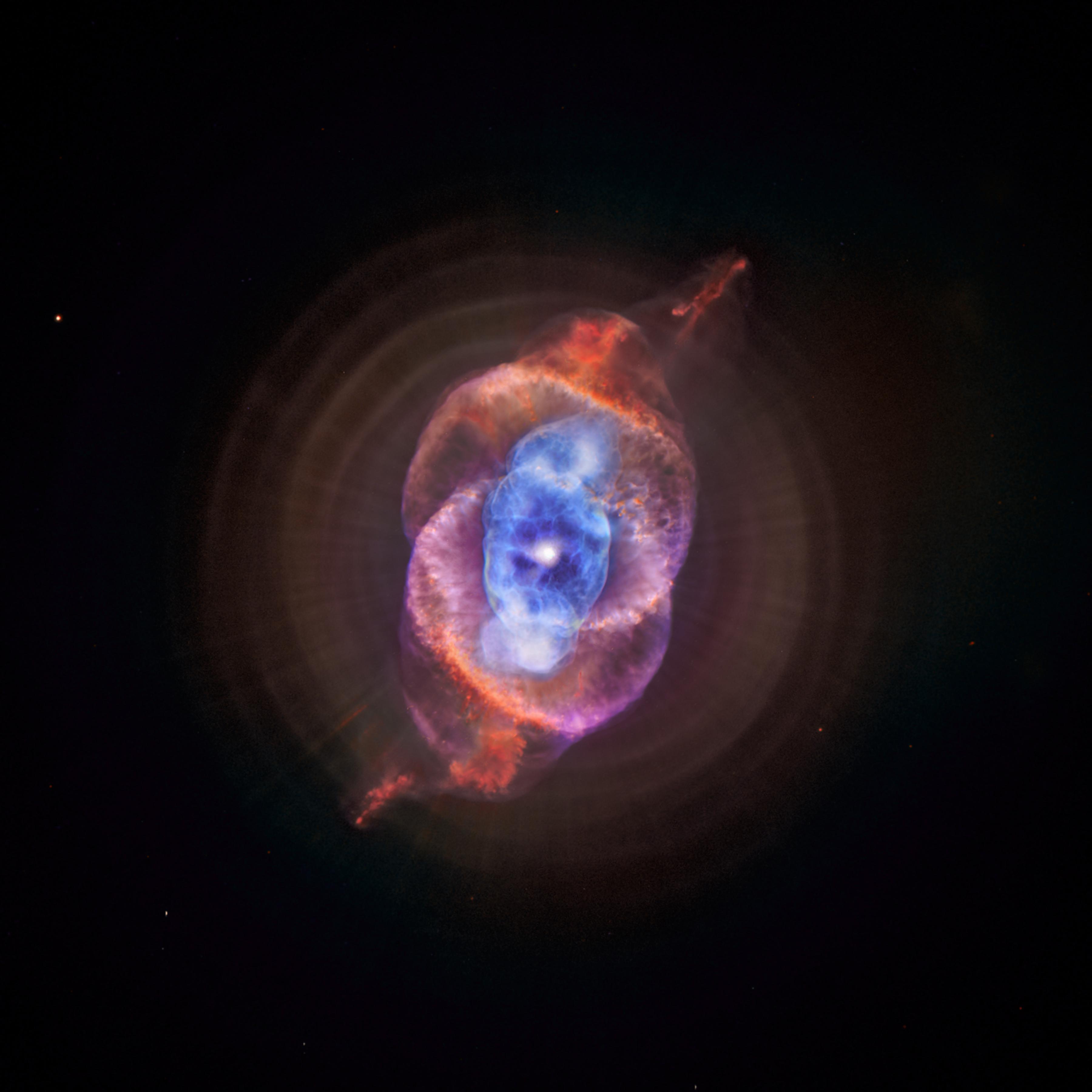
Earlier today, NASA reposted this shot via their Instagram account (yes, they have an Instagram account), shared earlier via the White House’s Instagram account (yes, they have an Instagram too).

As NASA explains in the photo write-up:

This composite of data from NASA’s Chandra X-ray Observatory and Hubble Space Telescope gives astronomers a new look for NGC 6543, better known as the Cat’s Eye nebula. This planetary nebula represents a phase of stellar evolution that our sun may well experience several billion years from now.

When a star like the sun begins to run out of fuel, it becomes a red giant. In this phase, a star sheds some of its outer layers, eventually leaving behind a hot core that collapses to form a dense white dwarf star. A fast wind emanating from the hot core rams into the ejected atmosphere, pushes it outward, and creates the graceful filamentary structures seen with optical telescopes.

In the case of the Cat’s Eye, material shed by the star is flying away at a speed of about 4 million miles per hour. The star itself is expected to collapse to become a white dwarf star in a few million years.

Coooooooooool. Again, we highly recommend both NASA’s image archives and image of the day series. Science fans and art fans alike will doubtless appreciate these images.

Image Credit: X-ray: NASA/CXC/SAO; Optical: NASA/STScI

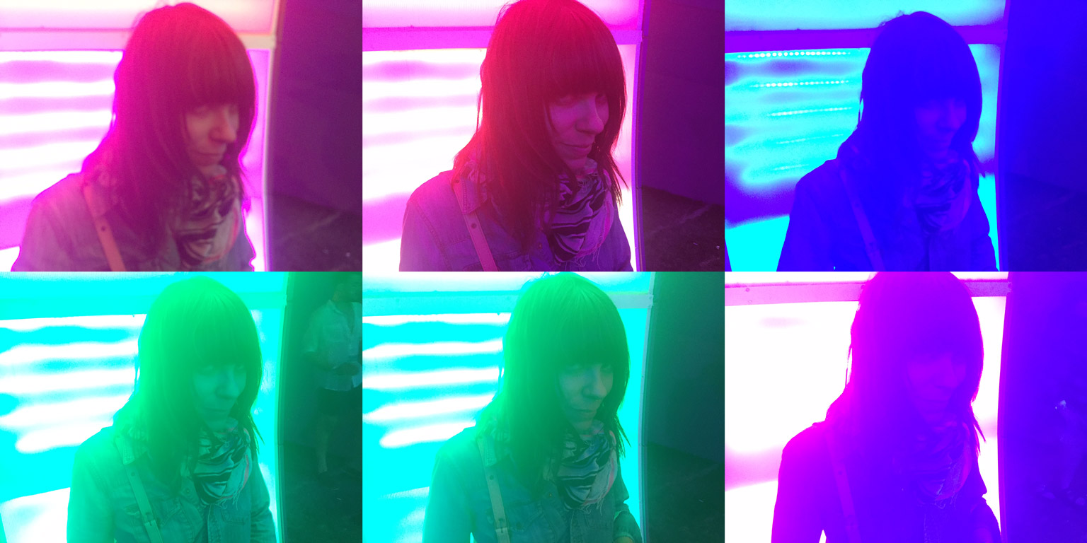
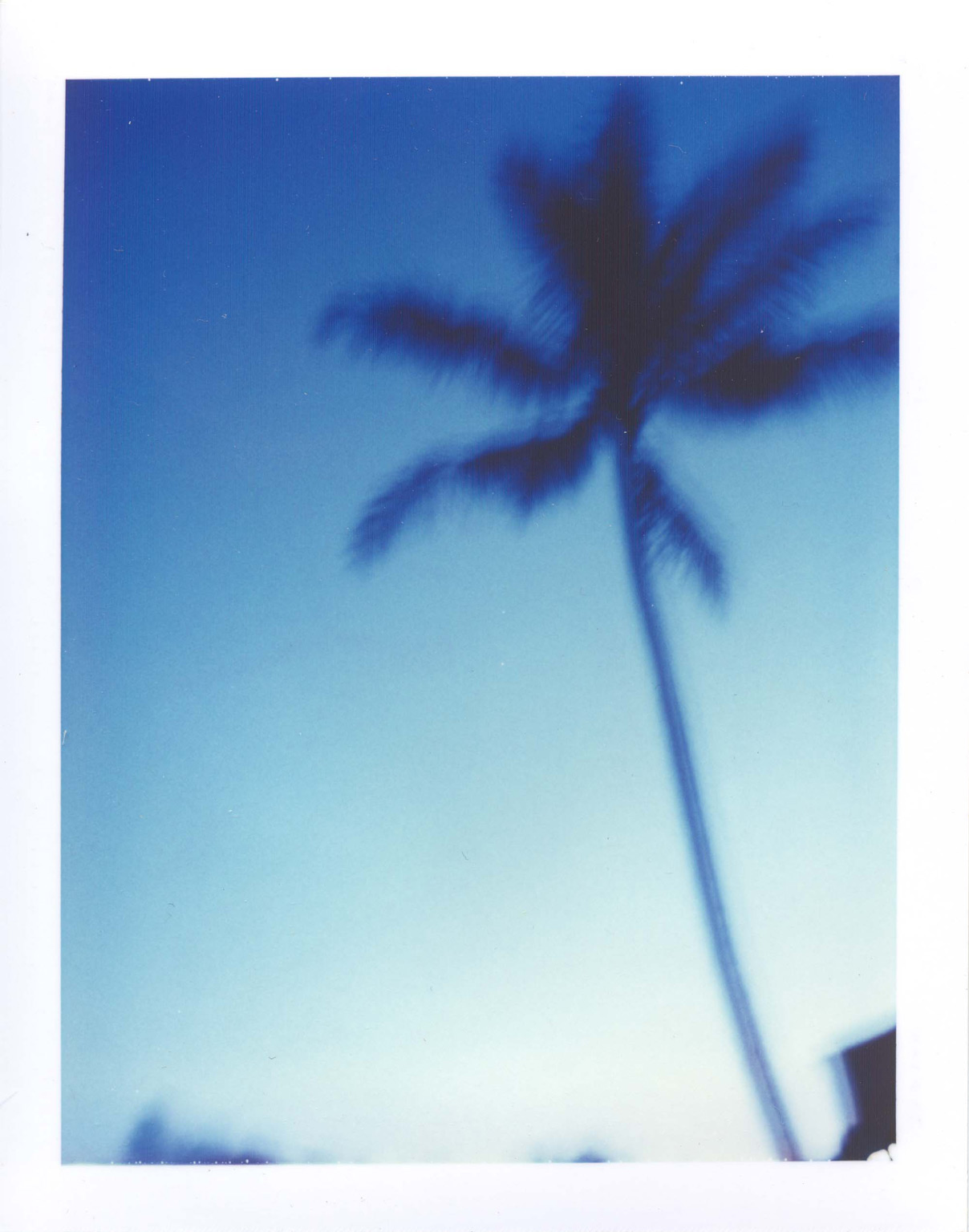
From the raven + crow photo archive, an old Polaroid from this 420, taken in Kauai, circa 2002.

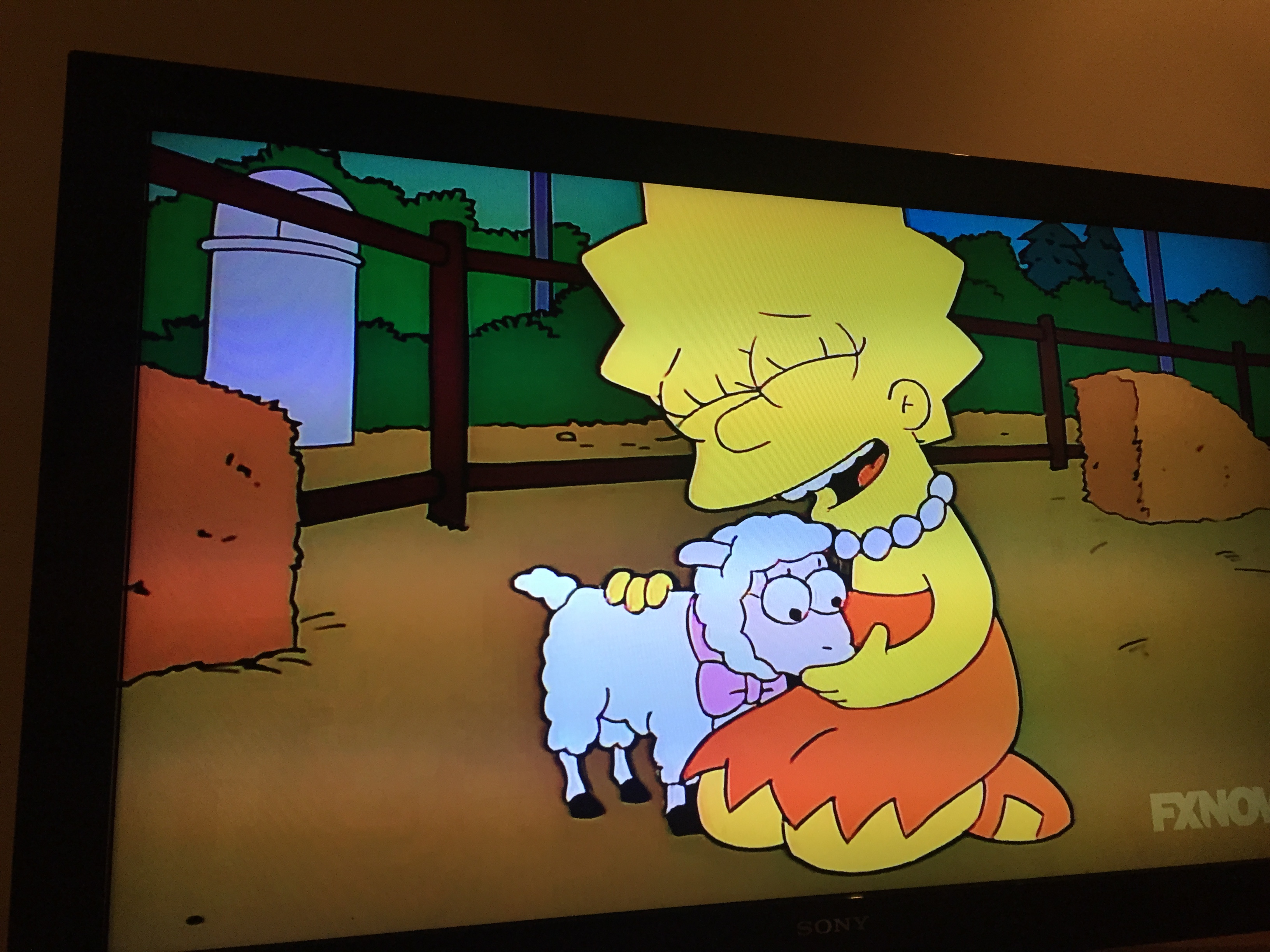
Twenty years ago this week, the world’s view on vegetarianism + veganism was changed with a single, hilarious, 30-minute-long episode of The Simpsons.

When it first aired, I myself had transitioned from vegetarian to vegan mere weeks before, so it definitely struck a chord with me on a personal level. More than that, it humanized and—oddly enough for a comedic cartoon—grounded the issue in a pretty honest reality, with both Lisa as she begins to identify with animals and with those around her, as they deal with the changes that come about in her personality.

All of this was beautifully rendered yesterday in a Slate article by Washington DC-based writer, Alan Siegel, commemorating the twentieth anniversary The Simpsons episode that Siegel writes “marked one of the first times on television that vegetarians saw an honest depiction of themselves—and of the viscerally defensive reaction that meat-eaters often have to vegetarianism.”

He explains further:

“Vegetarians previously had been portrayed in pop culture, but rarely as anything but one-dimensional hippies. ‘Lisa the Vegetarian,’ which aired on Oct. 15, 1995, was something different: a conversion story, told from the point of view of the person becoming a vegetarian. Lisa, the moral center of The Simpsons, spends the episode wrestling with what it means to eat meat. Her agonizing journey mirrors the one experienced by many in real life.

We highly recommend reading Siegel’s full article, which details how The Simpsons show runner at the time gave up meat and came up with the idea for the episode and how Paul and Linda McCartney got involved, which resulted in their one and only stipulation—that Lisa remain a vegetarian through the rest of the series. Twenty years later, that never-aging little girl stays as committed to animals as ever.

We re-watched the episode last night so many years later and it really does hold up, both in terms of hilarity and earnestness. If you have cable, you can watch every episode of every season (all 27) of the venerable show via SimpsonsWorld.com or through FXNow via Apple TV or the like. There’s even a random episode button that will doubtless result in many glorious lost hours at our home.

Below, a clip from the show when Lisa’s school becomes concerned with her turn and shows the class an education film titled “Meat and You: Partners in Freedom—Number 3F03 in the ‘Resistance is Useless’ Series”

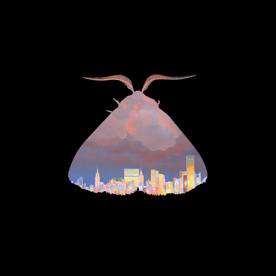
Some pretty cool art and an interesting teaser accompanied an announcement by Brooklyn band Chairlift today that they’d be premiering some new music Wednesday.

You can see the very brief teaser on their Facebook page; video of them performing the new song “Ch-Ching” at the film festival Tropfest New York this past June below.

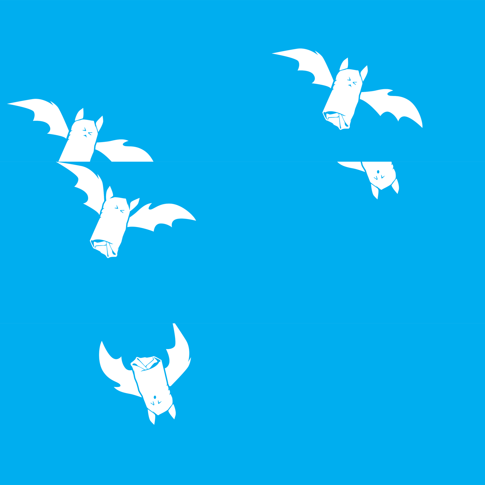
Just created this to help promote tomorrow’s vegan bake sale at MooShoes Los Angeles benefiting Burrito Project LA.

The day’ll feature a ton of vegan baked goods, raffles, some early Halloween fun, and vegan franks from the spookiest vegan in town, Frankenstand. We’ll be bringing some baked goods ourself. Keep it on the DL, but we’re thinking special vegan hand pies.

Here’s another batty burrito too.

Not sure what the Burrito Project is? Check out this interview with one of the group’s local organizers, Kathleen. And totally volunteer with them.

Hope to see you tomorrow! Details + RSVP.

We just added a branding project to our portfolio that we completed this past spring/summer for a local greenway and neighborhood environmental group, Westwood Greenway.

The group found us—oddly enough—through tacos.

As Greenway Steering Committee member Jonathan Weiss wrote us at the time:

“About a week ago, I went to a bike clothing sale where 100 Tacos was serving up veggie tacos.  I took a picture so I could find him later.  Searching for him, I found you.  And boy, was I blown away.  I may have come across you at just the right time…or not. We’re a group of volunteers who have been working to create a park—instead of a parking lot—next to a train station.  The park will clean water, restore a native ecosystem, and teach sustainability, among other things.”

Well, it did turn out to be just the right time. We scheduled calls with the members of the steering committee to learn more about the direction they’d hoped to take the Greenway, finding out along the way that they shared an impressively aggressive timeline with the City of Los Angeles as the city government pushed to open the new Westwood/Rancho Park Station of the expanded Metro Line.

After much discussion and focused feedback from the members, and some design exploration, we all decided to keep intact two key elements from the group’s original logo (below)—incorporation of railway imagery/concept to show “accessibility and environmentally responsible transportation” and the imagery/concept of the native Sycamore, which plays strongly into the architectural design of the Greenway itself.

WNG-Logo

In the end, we arrived at an elegant solution that gave the group more functionality and flexibility in their branding…and we met our event-centric deadlines. High fives all around!

You can watch Westwood Greenway’s video below—which incorporates our new logo—and visit their site to learn more.

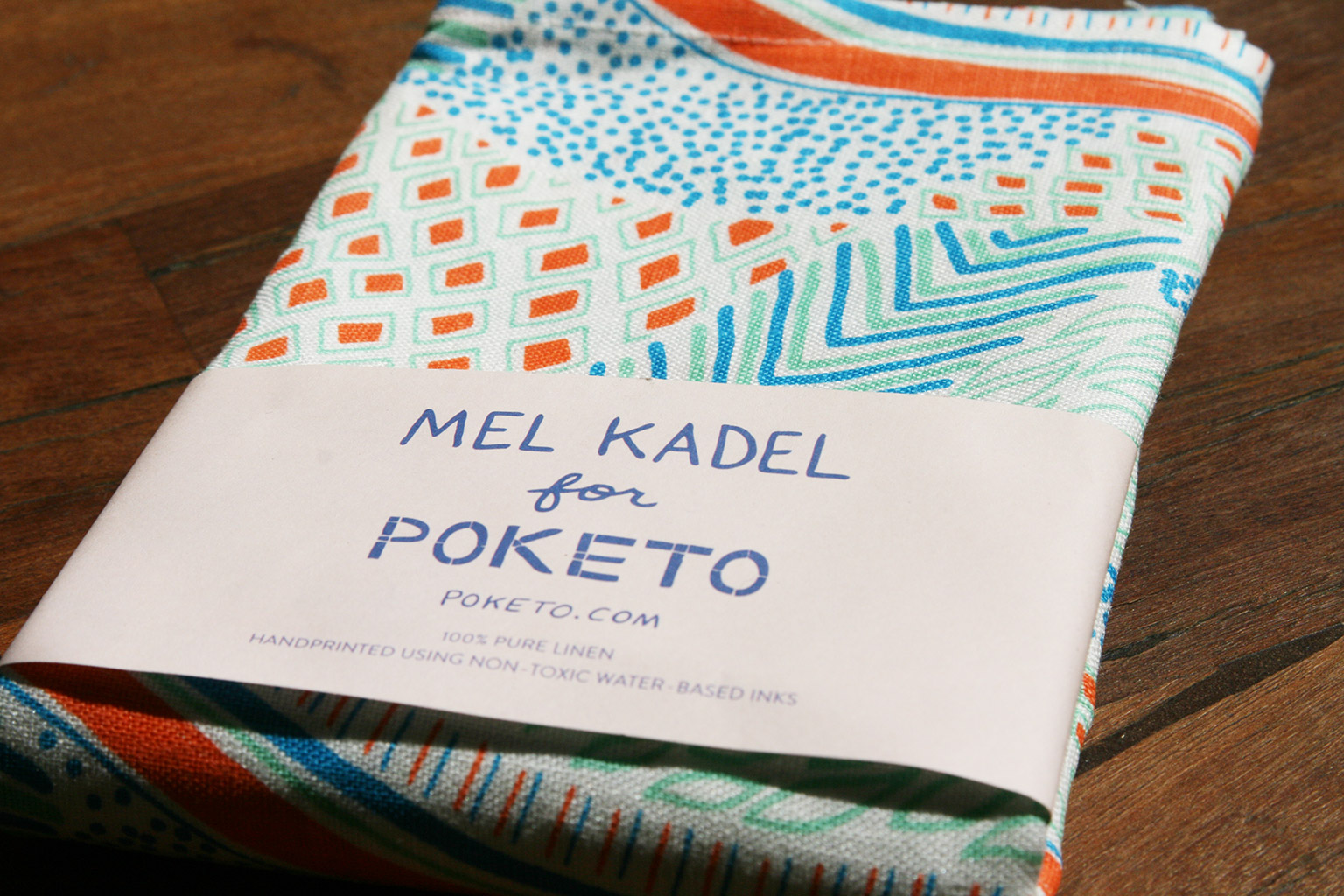
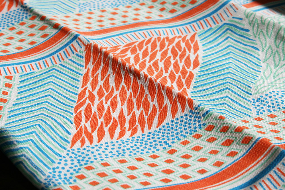
We couldn’t resist these new collaborative tea towels from local lifestyle store and purveyors of design-driven wares, Poketo + Los Angeles-based illustrator Mel Kadel.

Kadel—who’s originally from Harrisburg, Pennsylvania—works largely in pen, pencil, ink, and blades on a signature, Goonies map-esque treated paper. Her work is beautifully playful and subtly colorful, often depicting stoically powerful looking female figures dressed in vibrant patterns and busy at various odd tasks like holding up ducking, shooting rays of bubbles from their hands, and/or diving from walls of colored ribbons.

Kadel’s work has appeared in publications including Juxtapoz, The New Yorker, and LA Times Magazine and she’s currently in the midst of a solo exhibition—“Sky’s Eyes”—at Highland Park’s Slow Culture gallery. The show runs through October.

Tea towels available from Poketo in-store or online; Mel also sells hand-painted prints, postcards, and totes through her own site.

mel-kadel_5756

Last month, we embarked on what, for us, was a new way of using Instagram. We’ve found it to be both highly rewarding and somewhat troublesome and, after receiving some questions about it, we thought we’d do a brief write-up of the process here.

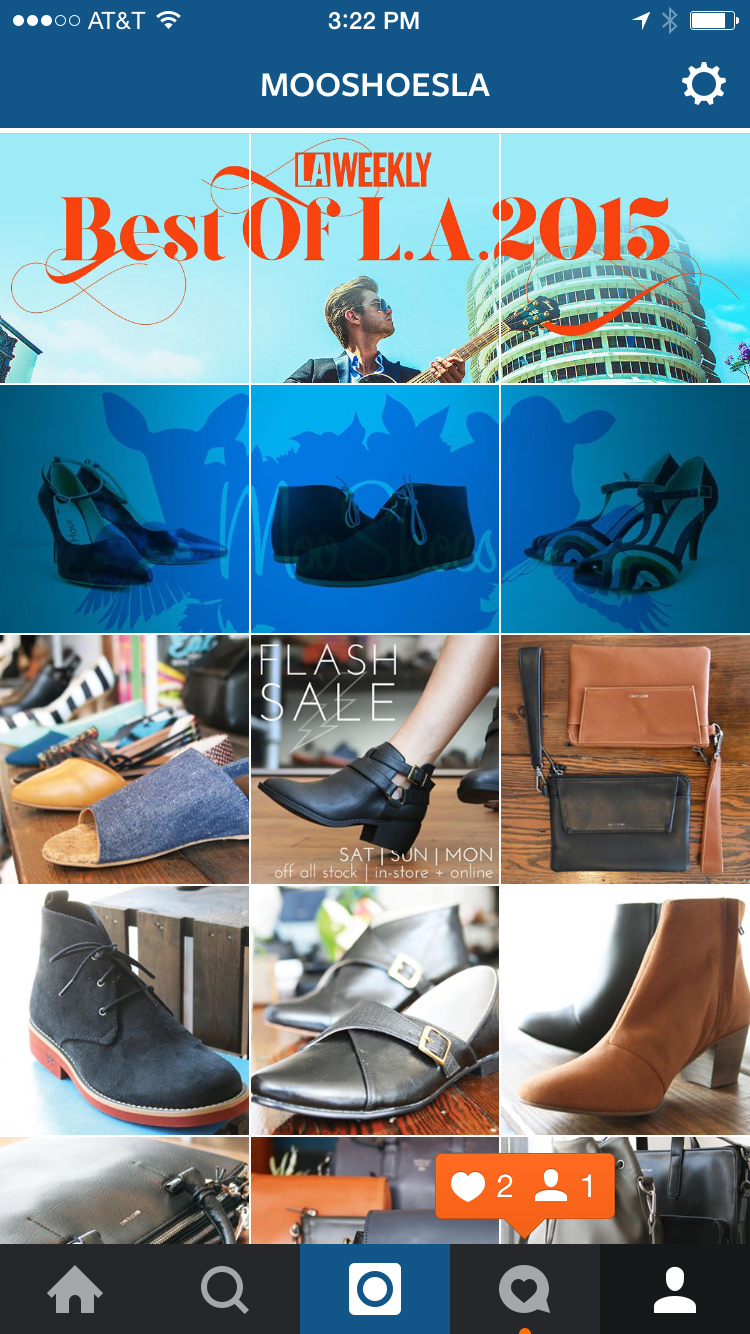
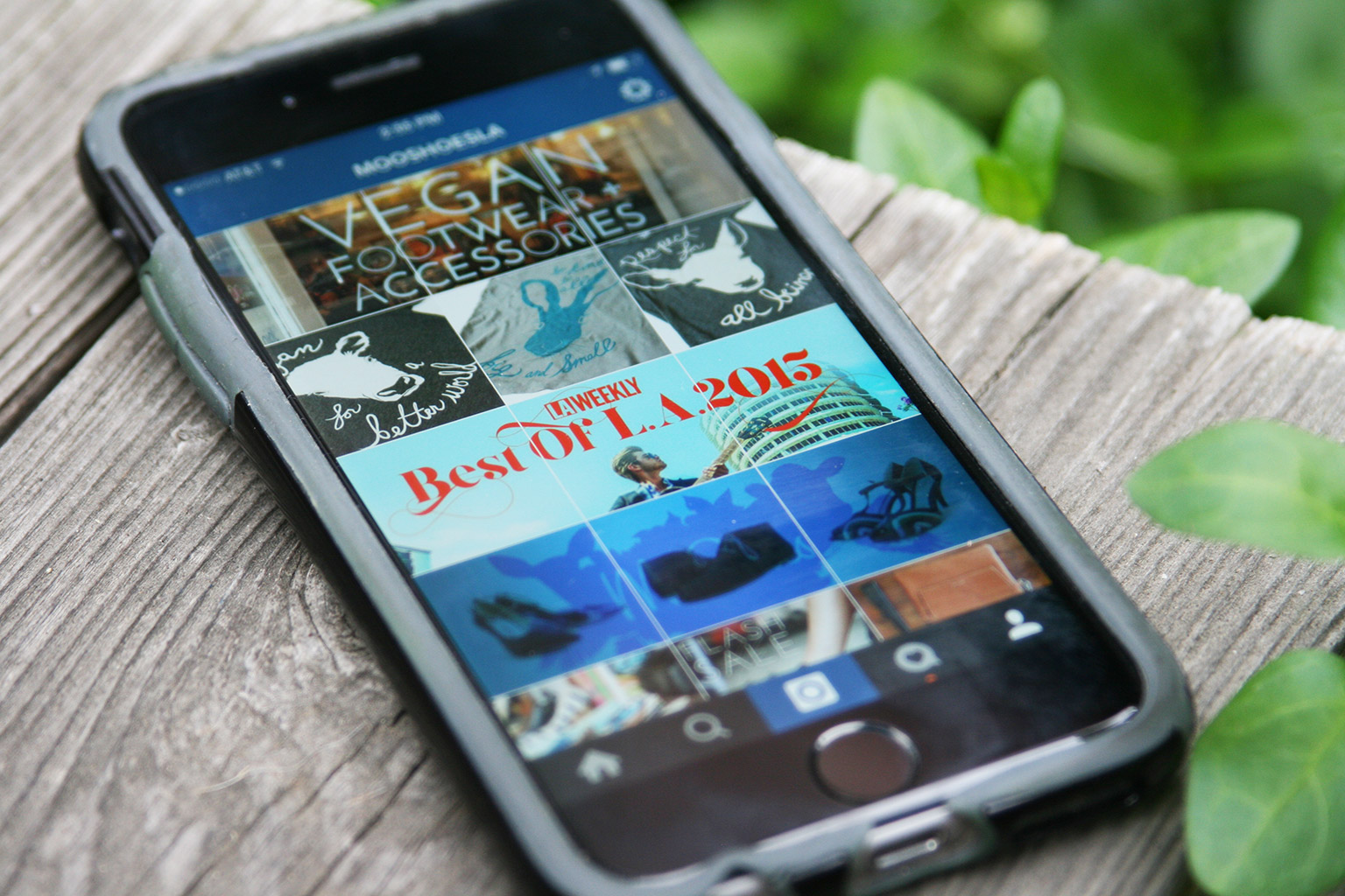
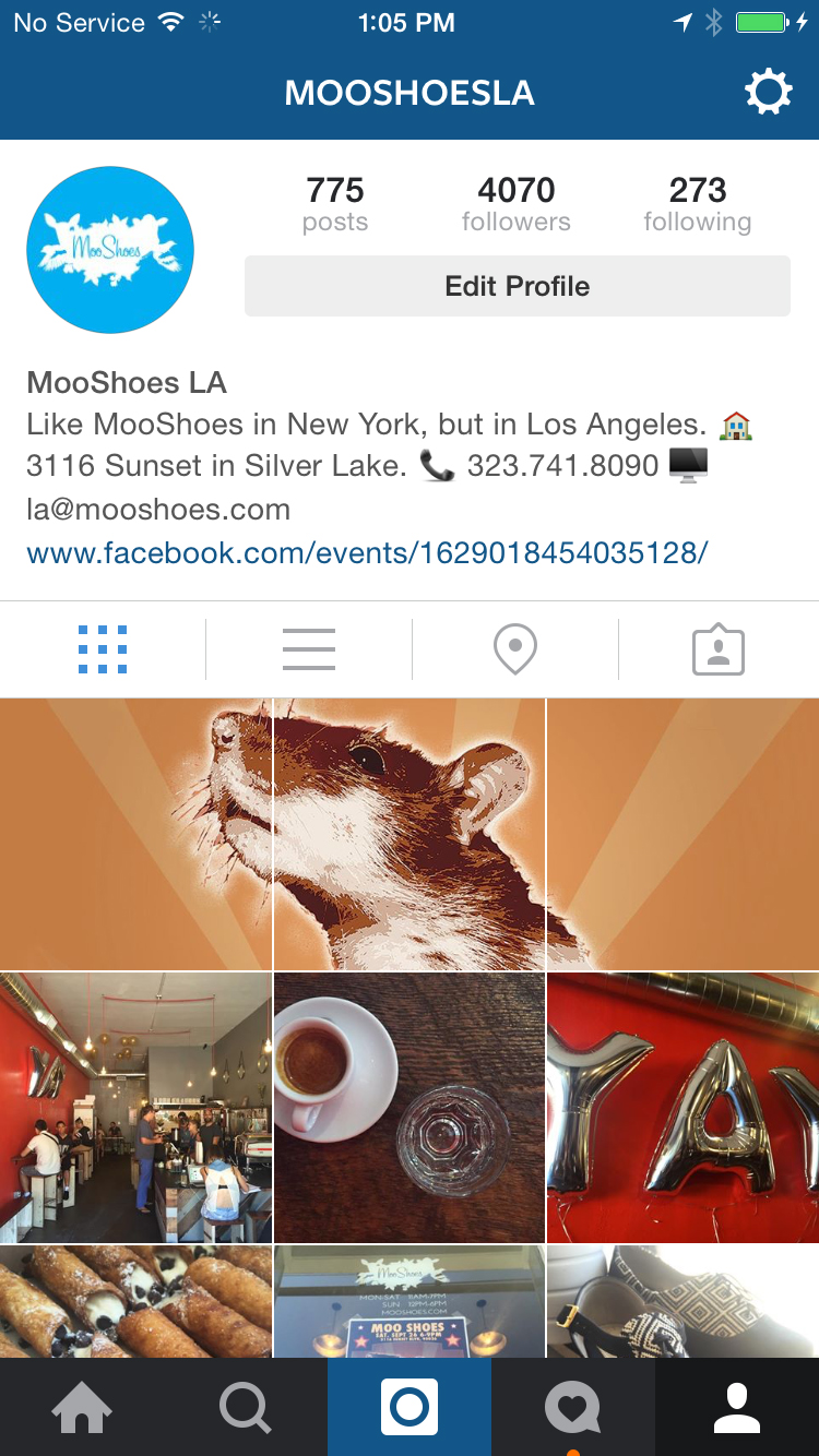
To be clear, we haven’t been using this process with our studio’s account—which dual functions as a personal account for me, Troy, and a professional design studio account—or with Katie’s personal account; this is something we’ve been using with the Instagram account for MooShoes Los Angeles, which we also manage. Many hats, friend. Many hats.

The process, which we’ve been calling set posting, but what’s more commonly called banner posting or tile posting, involves posting pictures in multiples of three to create larger banners when seen together on your profile page, as you see above and below here. This process isn’t really new in the world, it’s more new to us. In fact, there are plenty of third party apps that allow users to do this in a more streamlined manner than the way we do it—like BannerPic or GiantSquare or TilePic—but all of those and other similar apps get mixed reviews due to functionality issues, cost, and/or over-branding themselves on the end images. Plus we’re designers, meaning we love doing things the hard, DIY way.

When we post, whether it’s a original photograph or a collage or combination of illustrations or other design, we bring the images to be divided into PhotoShop whole, choosing the 3:1 view that’ll be seen as a whole in our profile view and then splitting up the three individual images with a 1:1 (square) crop and saving each for the Web at least 1080 pixels across (the current retina display quality for Instagram).
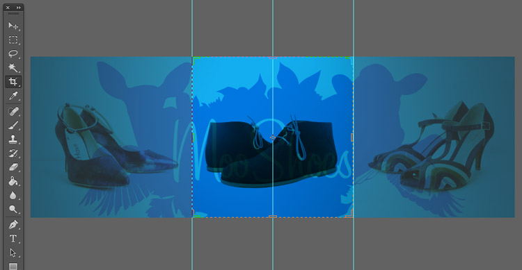
raven+crow

Then it’s a simple matter of uploading the three images.

Why do all the work for this? Well, for one, it’s cool-looking—one of the primary motivations for graphics designers in general, I’d say. More specifically, it’s both a way to get an edge over the visual competition for your followers and a way to pull them to your full profile page where your other posts, profile info, and URL are prominent. Providing a piece of the puzzle, so to speak, intrigues viewers and gives a break from the usual posting. From our month or so long experience and comments from users, we’ve noticed that it really engages and excites the audience when done right.

Once you start in and get used to it, you’ll also find that curating and planning for this kind of content stream will change how the original content is created. For instance, the third set down in the screen capture to the right—the one of Mick from 100 Tacos + Katie (which you can click on the see larger); with that image, we created a panoramic photo—so, wide and not tall—knowing that we were going to split it up in this way.

Pretty cool, right?

The rub? Well, there are a few:

1. If you choose to embark on this fun-yet-admittedly-arduous path, you need to realize that, from here on out, you’ll need to always post in multiples of three, otherwise, your profile page will get all jumbled up and the sets will skew, as they did recently for TOMS (right).

2. You also need to realize that, even if you commit to posting in multiples of three, you need to commit to doing so pretty quickly or all at once, ideally, otherwise you’ll have the same skewing problem until you get that third image (or sixth or ninth if you’re doing larger blocks) in there.

3. Though the intrigue and audience pulling’s awesome, you do risk confusing some of your less tech-/image-savvy audience members who don’t get why there’s a third of a shoe on their feed, for instance. We think it’s worth the risk; others may disagree.

In our minds, the main headaches are those first two—they throw you into a category of work that requires more planning and some more dedicated time, especially if the three images need three different captions. Most of the time, especially if the three are part of a whole, we create the first caption, tags and all, and copy before posting so we can then quickly paste them in to the other two images, making for a pretty streamlined process. Adding the hashtags quickly too allows for Instagram users to generally see your full, correctly assembled banner for a bit when exploring via hashtags, allowing for new opt ins.  We also generally edit images via Photoshop on a desktop rather than in IG, both so they’re ready to go for IG and so we can take advantage of the higher end perks of Photoshop. Also, we generally shoot on a wifi-less Canon SLR, so we have to transfer to a computer first anyway.

Again, there are easier ways to do this, so if you’re interested, feel free to look into those. We’re just self-abusing designers who love to create work for themselves, you know? In general though, we’ve seen more user engagement and a spike in account followers since taking this on. Plus it’s fun once you get used to the process.

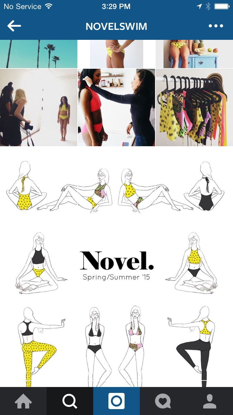
A few more examples from our MooShoes Instagram feed below and one from Novel Swim by Brooklyn illustrator Laura Rosenbaum, who premiered her company’s IG account with a pretty cool illustrated nine-piece block. Awesome work, Laura.
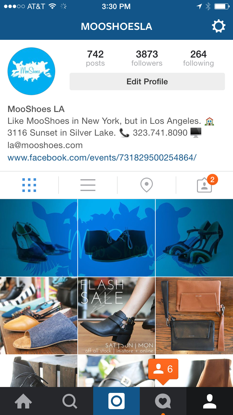
r+c-instagram_6971 r+c-instagram_6969 raven-and-crow_7551 raven-and-crow_7552

Though, as Henry Rollins recently eloquently explained, Autumn is much more a concept here in Los Angeles, less an actual season, we welcome October as the first full fall month and one of our favorites nonetheless. Even if it is going to be in the triple digits Friday.
With it, we present our October mixtape, being an accumulation of new sounds that we’re really digging of late.

This month we’re featuring some great new tracks from the likes of Montreal-based newcomers, Seoul; Jonquil frontman Hugo Manuel’s excellent solo electronic-R+B project Chad Valleyanother newcomer, Bayonne—AKA, Roger Sellers—from whom we’ve only heard a single track, but, man, that track; an impressive Battles-esque  track from OK City’s Tallows; a new showing from someone we haven’t heard from in a bit, Brooklyn’s Small Black; a new one from someone we really haven’t heard from in a while, German ‘indietronica’ band, Ms. John Soda of Morr Music; and, of course, much much more.

Listen below or on our soundcloud page, and be sure to check out past mixtapes if you’re looking for more.

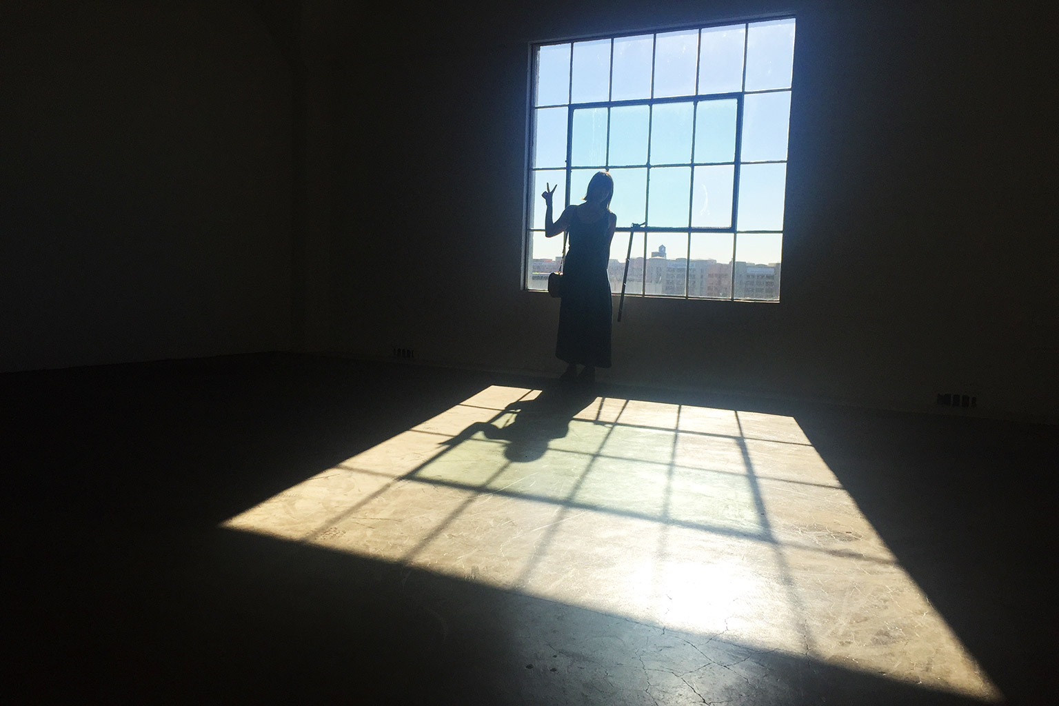
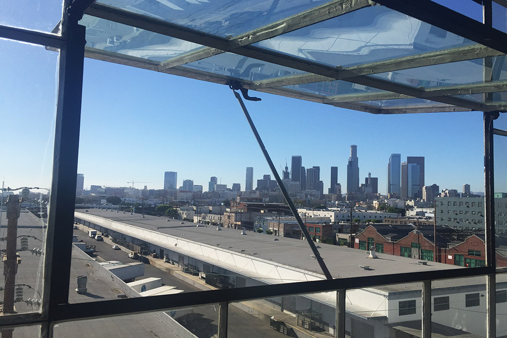
After a little over a year-and-a-half of enjoying our outdoor office (which we wrote up last year), we’re officially announcing that we’ll be moving the design studio indoors to a new space in the now bustling Arts District in downtown Los Angeles.

The move’s partly a desire to re-separate work and life, partly a desire to have a dedicated space for professional creation + meetings, partly wanting to center ourselves in the booming creative scene that has become (not without controversy) downtown LA, and…partly because we are getting way too much sun out here, man. Seriously. Nearly every conversation we have with friends we haven’t seen in a while starts with “You two are so tan!”

So, doctor’s orders—new studio space.

We just signed the lease yesterday and will begin moving in mid-month, so we’ll doubtless have more images of the new space to come once we’ve prettied it up a bit, but suffice to say, we’re very excited.

More soon, friends.

raven+crow-studio_7050