Last month, we embarked on what, for us, was a new way of using Instagram. We’ve found it to be both highly rewarding and somewhat troublesome and, after receiving some questions about it, we thought we’d do a brief write-up of the process here.

To be clear, we haven’t been using this process with our studio’s account—which dual functions as a personal account for me, Troy, and a professional design studio account—or with Katie’s personal account; this is something we’ve been using with the Instagram account for MooShoes Los Angeles, which we also manage. Many hats, friend. Many hats.

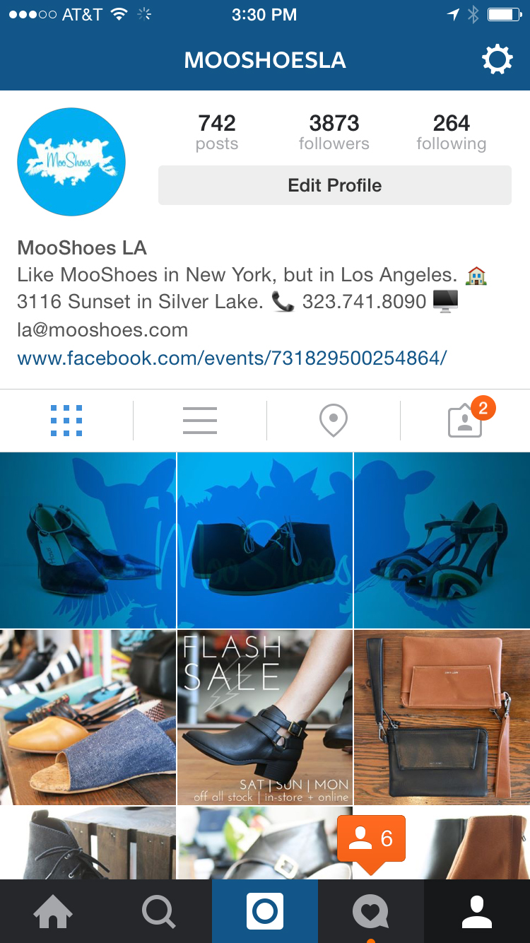
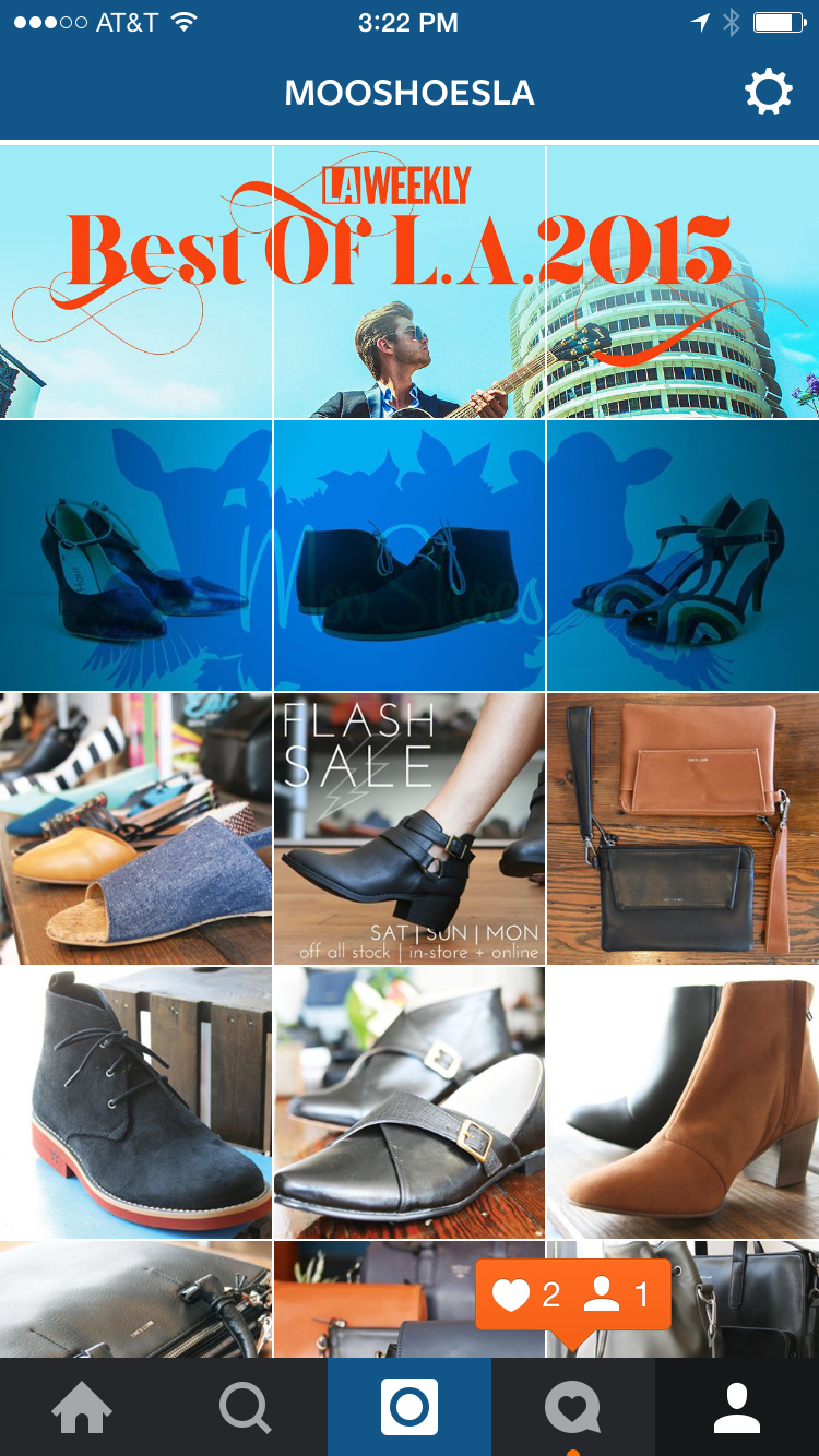
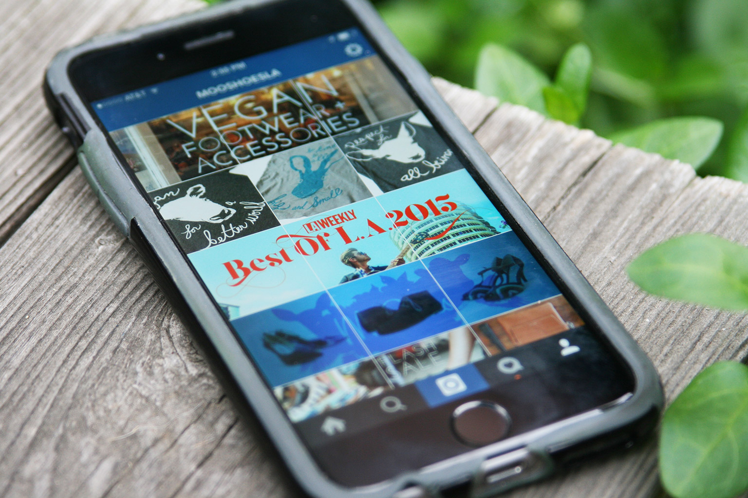
The process, which we’ve been calling set posting, but what’s more commonly called banner posting or tile posting, involves posting pictures in multiples of three to create larger banners when seen together on your profile page, as you see above and below here. This process isn’t really new in the world, it’s more new to us. In fact, there are plenty of third party apps that allow users to do this in a more streamlined manner than the way we do it—like BannerPic or GiantSquare or TilePic—but all of those and other similar apps get mixed reviews due to functionality issues, cost, and/or over-branding themselves on the end images. Plus we’re designers, meaning we love doing things the hard, DIY way.

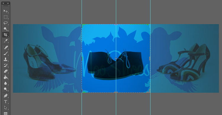
When we post, whether it’s a original photograph or a collage or combination of illustrations or other design, we bring the images to be divided into PhotoShop whole, choosing the 3:1 view that’ll be seen as a whole in our profile view and then splitting up the three individual images with a 1:1 (square) crop and saving each for the Web at least 1080 pixels across (the current retina display quality for Instagram).

raven+crow

Then it’s a simple matter of uploading the three images.

Why do all the work for this? Well, for one, it’s cool-looking—one of the primary motivations for graphics designers in general, I’d say. More specifically, it’s both a way to get an edge over the visual competition for your followers and a way to pull them to your full profile page where your other posts, profile info, and URL are prominent. Providing a piece of the puzzle, so to speak, intrigues viewers and gives a break from the usual posting. From our month or so long experience and comments from users, we’ve noticed that it really engages and excites the audience when done right.

Once you start in and get used to it, you’ll also find that curating and planning for this kind of content stream will change how the original content is created. For instance, the third set down in the screen capture to the right—the one of Mick from 100 Tacos + Katie (which you can click on the see larger); with that image, we created a panoramic photo—so, wide and not tall—knowing that we were going to split it up in this way.

Pretty cool, right?

The rub? Well, there are a few:

1. If you choose to embark on this fun-yet-admittedly-arduous path, you need to realize that, from here on out, you’ll need to always post in multiples of three, otherwise, your profile page will get all jumbled up and the sets will skew, as they did recently for TOMS (right).

2. You also need to realize that, even if you commit to posting in multiples of three, you need to commit to doing so pretty quickly or all at once, ideally, otherwise you’ll have the same skewing problem until you get that third image (or sixth or ninth if you’re doing larger blocks) in there.

3. Though the intrigue and audience pulling’s awesome, you do risk confusing some of your less tech-/image-savvy audience members who don’t get why there’s a third of a shoe on their feed, for instance. We think it’s worth the risk; others may disagree.

In our minds, the main headaches are those first two—they throw you into a category of work that requires more planning and some more dedicated time, especially if the three images need three different captions. Most of the time, especially if the three are part of a whole, we create the first caption, tags and all, and copy before posting so we can then quickly paste them in to the other two images, making for a pretty streamlined process. Adding the hashtags quickly too allows for Instagram users to generally see your full, correctly assembled banner for a bit when exploring via hashtags, allowing for new opt ins.  We also generally edit images via Photoshop on a desktop rather than in IG, both so they’re ready to go for IG and so we can take advantage of the higher end perks of Photoshop. Also, we generally shoot on a wifi-less Canon SLR, so we have to transfer to a computer first anyway.

Again, there are easier ways to do this, so if you’re interested, feel free to look into those. We’re just self-abusing designers who love to create work for themselves, you know? In general though, we’ve seen more user engagement and a spike in account followers since taking this on. Plus it’s fun once you get used to the process.

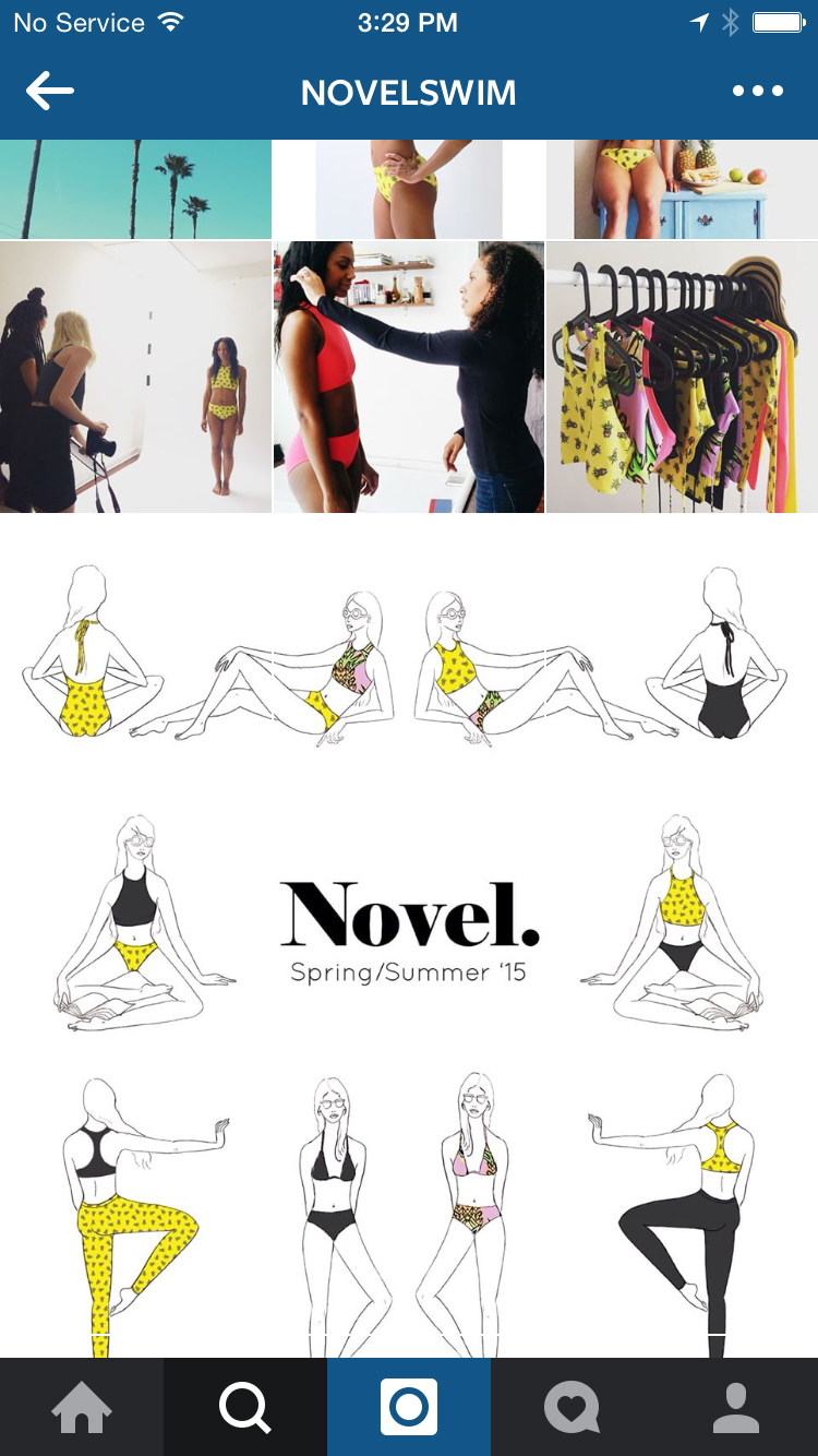
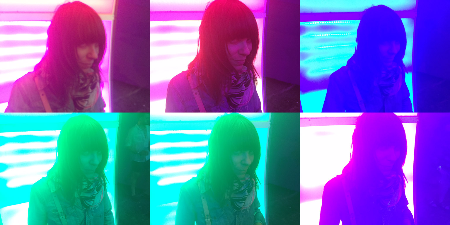
A few more examples from our MooShoes Instagram feed below and one from Novel Swim by Brooklyn illustrator Laura Rosenbaum, who premiered her company’s IG account with a pretty cool illustrated nine-piece block. Awesome work, Laura.

r+c-instagram_6971 r+c-instagram_6969 raven-and-crow_7551 raven-and-crow_7552

Though, as Henry Rollins recently eloquently explained, Autumn is much more a concept here in Los Angeles, less an actual season, we welcome October as the first full fall month and one of our favorites nonetheless. Even if it is going to be in the triple digits Friday.

With it, we present our October mixtape, being an accumulation of new sounds that we’re really digging of late.

This month we’re featuring some great new tracks from the likes of Montreal-based newcomers, Seoul; Jonquil frontman Hugo Manuel’s excellent solo electronic-R+B project Chad Valleyanother newcomer, Bayonne—AKA, Roger Sellers—from whom we’ve only heard a single track, but, man, that track; an impressive Battles-esque  track from OK City’s Tallows; a new showing from someone we haven’t heard from in a bit, Brooklyn’s Small Black; a new one from someone we really haven’t heard from in a while, German ‘indietronica’ band, Ms. John Soda of Morr Music; and, of course, much much more.

Listen below or on our soundcloud page, and be sure to check out past mixtapes if you’re looking for more.

As we continue our very gradual coming down from the high that is seeing Ms. Grace Jones live at the Hollywood Bowl this past weekend, we’re reminded of that legendary post-disco diva in the music of new-comer, Monika Christodoulou, the Athens, Greece native who goes by the simplified Monika.

Monica’s already made a name for herself in her native Greece with her first two albums and has been peaking interest stateside with her new album, Secret in the Dark, out today on Other Music Recording Co. (the relatively new label and offshoot of our longtime favorite NYC record store, Other Music).

The title track provides a groove-filled, disco soundtrack for New York City nights, regardless of your locale. Check out the video below.

You can order Secret in the Dark on CD + LP via OMRC and digitally on iTunes.

Excellent photo by Eilon Paz.

After a little over a year-and-a-half of enjoying our outdoor office (which we wrote up last year), we’re officially announcing that we’ll be moving the design studio indoors to a new space in the now bustling Arts District in downtown Los Angeles.

The move’s partly a desire to re-separate work and life, partly a desire to have a dedicated space for professional creation + meetings, partly wanting to center ourselves in the booming creative scene that has become (not without controversy) downtown LA, and…partly because we are getting way too much sun out here, man. Seriously. Nearly every conversation we have with friends we haven’t seen in a while starts with “You two are so tan!”

So, doctor’s orders—new studio space.

We just signed the lease yesterday and will begin moving in mid-month, so we’ll doubtless have more images of the new space to come once we’ve prettied it up a bit, but suffice to say, we’re very excited.

More soon, friends.

raven+crow-studio_7050

Just came across this imagery we created for a yard sale + crafts fair we helped organize in DC in the summer of 2003, just before we moved up to New York.

Still dig it, man.

Experimenting with light a bit today.

Light2

No huge piece here, just, if you ever get a chance, definitely go see Grace Jones perform live.

No matter what else is going on.

Just. Go.

Photo above by Drew A. Kelley; below, a shot Katie got of of Ms. Jones performing alongside the supermoon lunar eclipse at the Hollywood Bowl last night.

Epic.

IMG_0067

Pomegranates are soooooooo late-ninties when it comes to vibrantly colored super-foods.

To get with the times, we’re jumping on the pitaya bandwagon—formerly known as the dragon fruit bandwagon…which we assume was an attempt at rebranding the brightly colored fruit to appeal to video-game-playing teens.

We picked one up at the farmers’ market the other day, cut it open, and found that it practically glowed fuschia—Pantone 233, by our estimation.

Blend with a frozen banana, spare plum, a little almond milk, and a handful of ice, and you’ve got yourself a pretty tasty, evidently lifesaving smoothie.

raven+crow-smoothie_7090

We’re holding a cocktail benefit for local non-profit Art for Animals’ Sake at MooShoes LA Saturday night and, as part of the art-centric, rat-centric event, our design studio created these limited edition prints that’ll be available night of.

The Rattie Uprising, as AAS is calling it, will feature artwork for sale to benefit the group, like our prints; vegan food + cocktails; and general merriment and celebration in honor of our smaller animal friends. Much like the raven + crow, the rat’s been stigmatized largely in western culture, so we feel our furry friends’ pain and are happy that someone’s giving voice to them.

Below, some fun facts about rats paired with adorably cute photos of them and a promo video, all courtesy of David Walega of Art for Animals’ Sake.

If you’re in the LA area Saturday, check out info on the event and RSVP via Facebook.

TRU_ratfacts_cleaning_small TRU_ratfacts_laughing_small TRU_ratfacts_sleeping_small

Can’t. Stop. Listening.

Our most recent musical obsession of late is without a doubt Ryan Adams‘ ambitious, much-buzzed-about, bizarre, visionary (yes, I said visionary) beginning-to-end sequential cover of Taylor Swift‘s album 1989.

We’d heard about the project but, honestly, not thought much of it. Adams strikes me as a fairly sincere, nice guy, so I didn’t for a second think it was a tongue-in-cheek thing (which, it turns out, it is not), but I also didn’t expect it to be all that great in the end. Boy was I wrong about that. Whether you’re familiar with the original versions or not, whether you’re a Swift fan or not (I assume there are some people out there who don’t like Taytay, right?), it’s worth a listen. More than that, I’d wager there’s something there for most everyone. It lives and breathes as it’s own album almost, and I keep finding myself forgetting the songs’ origins…until Adams sadly croons “haters gonna hate hate hate” maybe.

As Adams told Rolling Stone recently, the project started off as a personal catharsis and his admiration for Swift and her music is, in fact, 100% sincere. When rumors of the Adams’ 1989 surfaced, Swift was nothing but genuinely excited to hear it. Once it came to fruition, Adams’ sent Swift everything and the two talked it out in detail the next day. And as Adams claims, that was originally going to be it—”I just wanted to make it for me and play it for her and be done,” he told Rolling Stone. But, after being encouraged by friends and Swift herself, Adams finally decided to let his 1989 live. And thank god he did, for it is awesome.

“It’s not a reimagining or a reconstruction at all,” Adams told Rolling Stone. “It’s a parallel universe. That’s how I think of it. We’re creating an alternate universe, like in Marvel Comics.”

Dude’s speaking my language. Give it a listen below.

(Adams’) 1989 is available now digitally and will soon enjoy CD + vinyl releases. Keep your fingers crossed for a Swift-Adams world tour.