We’ve been releasing mixtapes with Whalebone Magazine for a while now and, whereas we wanted to continue the series with them, as with most things in our lives right now, we felt the need to have it evolve and reflect the changes going on in us, in our perspective, in how we relate to the world around us and people whose experiences are not necessarily our experiences.

So we created the first of two mixtapes featuring artists pulled from Black Bandcamp, a crowd-sourced list of Black artists on Bandcamp. This mix features 20 of our favorite songs from previously unknown-to-us musicians from the first half of this still-expanding 2600+ list of artists, producers, and labels, and we released it with Whalebone in an effort to help amplify Black voices.

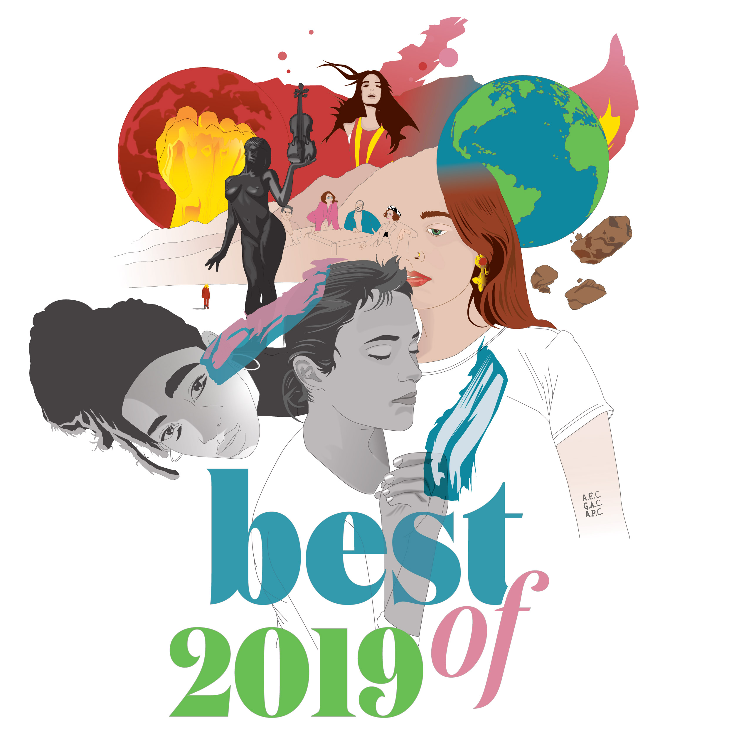
Accompanying the mix is an interview we did with Franklin James Fisher of Algiers (upper left in the illustration we did above), whose band kicks of the mix with the powerful line:

“Run around, run away from your America
While it burns in the streets.”


You can listen to the mix and read the interview over at whalebonemag.com. And stay tuned for part two soon.

Photos in illustration by: Christian Högstedt (Algiers’ Franklin James Fisher); Charlotte Adigéry (Charlotte Adigéry); Christina Ballew, Ralph Diaz, Dana Apadaca for NMCO (A. Billi Free); Baba Ali + 79rs Gang unknown

Whalebone Magazine published our most recent mixtape of new sounds in the future pop realm along with a conversation about these weird times. You listen below and read + listen along over at Whalebone Mag too.

Socially distant + stay-home-friendly video for Austra‘s track below for added bonus.

Stay safe, friends.

Illustration by us. Photos: Jamie Sinclair (Westerman), Virginie Khateeb (Austra), Rebecca Scheinberg (Denai Moore), Ela Minus (Ela Minus), Nathan Bajar (Cautious Clay), Ruaraid Archilleos-Sarll (Låpsley), Christopher Honeywell (Braids).

Branding work largely is and always has been the bread + butter of our studio’s work for the past thirteen plus years.

For anyone not really familiar with the term, branding goes well beyond your logo. Done right, brand development not only gives you an effective working logo, but, more importantly, it approaches your mission, audiences, vision, and future marketing practices at a wholistic, predictive level, giving your business, non-profit, NGO, or any other enterprise a strategically distinctive voice + edge in a competitive market, regardless of what that market is.

But before we even get to that point as a studio, we’ve always strongly prioritized exploration of differential paths along the way for our clients. Put more clearly, less jargon-y-ly—we want our clients to see a bunch of solid, exciting, and (maybe above all) fun + cool choices from the start; paths that are distinct choices in terms of brand direction, each of which achieve the client’s goals in different ways. After all, there’s no one singular path to success, in this realm or any other.

So we thought it might be helpful—and fun—to share a glimpse into our brand development process in specific, walking through some of the design paths we explored with an actual client. The client in question—GirlVentures, a Bay Area non-profit that inspires girls to lead through outdoor adventure, inner discovery, and collective action. Here you’ll find the organization’s final brand (above) and some of the brands and draft logos we explored for and presented to GirlVentures along the way (shown here with the client’s permission, of course).

We always start theses processes off with a kind of survey that organically teases out some foundational ideas for the developing brand in a way that can easily be understood, whether you consider yourself a ‘visual person’ or not. That’s followed by meetings—be them in-person or remote—so we can talk things through with the client in as natural a way as possible.

GirlVentures came to us through Julia Hornaday, a UK-based marketing consultant + strategist who was in the process of helping the group to evolve their entire mission + vision, putting a greater emphasis on leadership, inclusivity, and social justice through outdoor education and mentorship. Wanting to fold those ideas into an equally evolved brand that would telegraph that newly honed messaging, much of the emphasis throughout the process were on the duality between the “what”—leadership, identity, and community for girls—and the “how”—outdoor education, environmental stewardship, and the profoundness of the natural world.

That, along with further background, story, and audience information that we developed over time in the process, led to multiple branding paths, both in our initial + subsequent rounds of work and presentations. Actually looking back and counting now—8 in the first round of work, and 21 in later rounds, most exploring totally distinct design paths, but a few acting as slight variations on a parent draft brand.

With each draft brand we present, we also show clients some simple mock-ups—we’ve found this helps everyone picture how the brands could be used in the real world rather than just floating in a kind of visual void, especially for self-described “non-visual-types”.

So be it a mock-up of a brochure or publication or some merch or a web page created with design software or actually built on the quick so it’s responsive on screens, we’ve found that doing this extra bit of work up front both streamlines the process as a whole and helps raise confidence in the brand as the client can see it being used, making its benefits + advantages more clear to everyone, ourselves included.

Specially with GirlVentures, we pretty quickly zeroed in on tapping the natural world for our primary imagery, partly because of the universal appeal and root of it in GirlVentures work, partly due to an old branding adage we’ve found holds up to most marketing tests—if it’s in your name, don’t put it in your logo; if it’s in your logo, don’t put it in your name.Even if you know nothing about the group (which is generally a good place to start when thinking about most audiences), it’s clear to anyone who understand English that girls are core to the mission of GirlVentures. What’s not clear in the name is the “how”—the transformative nature of the outdoors. So, early on, that vein of imagery strategically began to dominate the paths of design + messaging.

In the end, after narrowing the range on style and a few basic natural elements, we played around with color, enclosing shape, layout, and other variables until we ended up with our final mark + overarching brand. Then with this branding projects as with all others, we package files, delivering a tidy folder with a full range of file formats for every need and a basic one-sheet with guidance on when to use what and some best practices for logo use. We also create larger guidance publications that can number in the 20s, 30s, or more in pages, but those are usually reserved for our larger clients who know they’ll be doing a lot of cross-org/cross-business work with their brand or have a lot of file use outside their own departments.

But this is just one branding story for one client—though we’ve seen our fair share of commonalities in working through this process over the past thirteen plus years, we’ve also learned that every client and every process is unique, which, in addition to making this work our bread + butter, also makes it some of the most exciting + fun work we do.

Want to see more of these brand dev. breakdowns? Take a look at our portfolio and let us know if you’d like to know the story behind one we’ve done; if the client’s cool with it, we’ll share here.

A couple weeks back, right when it started to become clear that this whole situation we’re all in right now was something much larger and longer-lasting than we first thought, we started to focus more on what’s traditionally brought us peace + calm in the most trying of times.

Like many others, we went immediately to music. These days, for better or worse, many of us are locked into a certain habitual way of taking in music—we put on our usual stream from Spotify or Apple or whomever and we hear what we’ve heard before or something similar; echo chambers of music without much organic or natural exploration, much like how many of us now take in our news or politics or ‘facts’.

But in this instance, our minds went back to another time when music—though far less free-flowing—was shared more deliberately.

We’ve talked about this on these pages before, but back in Brooklyn, in the aughts, some friends of ours started this monthly mixtape club we were part of. The idea itself was harkening back already, to those years for us in high school + college when we’d spend hours selecting songs and recording a mixtape on a cassette for a friend; and then spend maybe as much or more time creating the cover art for the same tape. But in this club, dubbed the Brooklyn Music Exchange (BMX), once a month a member of the twenty or so person collective put together a mix of tracks from different artists and then would make as many CDs as there were members, mailing them out to each member. In kind, each member got a new mix of music every month. Sometimes they were themed, sometimes not, but it was a really fun way to both engage with each other creatively and discover music we might not have otherwise. To this day, we count some of our favorite bands amongst ones we discovered through BMX and these friend-curated mixes.

So we decided to rekindle this club, reaching out to friends, cohorts, and just people who’s taste in music we respect for songs in two separate-but-timely themes:

BREATHE—favorite songs that bring peace + calm
and
DANCE—favorite songs that bring joy + movement

Here we’re sharing both those mixtapes for anyone who wants to listen. We hope they bring you both peacefulness and dance parties.

Endless thanks to the friends who helped bring these together with us (in no particular order): Jessica Schoen, Thad Knouse, originator of the BMX Agatha Knouse, Dave Dalton, Anne Cunningham of the band Trummors, John Capone of Whalebone Magazine, Flow from Morr Music, our favorite KCRW DJ José Galván, Danielle Fee, Susie Heimbach, Jeff Gramm, Becca Walker, Maureen Hoban, Paul Singh of Pel, Allison Brooker, and everyone else who contributed or wanted to but couldn’t make the time or bandwidth—we love all y’all!

Stay safe, stay well, stay sane—we’ll all be dancing together in person before we know it.

Track list for each mix below for anyone who wants it.

B R E A T H E
1—Fire Truck—Andy Shauf
2—Our Swords—Band Of Horses
3—I Can Feel It—Sloan
4—5 Long Days—Mind Shrine
5—Dead Mans Will—Calexico / Iron And Wine
6—Windfall (2015 Remastered)—Son Volt Trace (Expanded)
7—Up All Night—The War On Drugs
8—Gimme Shelter—The Rolling Stones
9—I Can’t Let Maggie Go—The Honeybus
10—Trees We Couldn’t Tell The Size Of—Wished Bone
11—Wildflowers—Tom Petty
12—Boat Song—Garrett Pierce
13—Alton Ellis + Hortense Ellis—Breaking Up
14—Take What You Can Carry—Mia Doi Todd
15—Heart Of Glass—Lily Moore
16—All the Pretty Girls—KALEO
17—Higher Than the Sun (Single Mix)—Primal Scream
18—Desert Raven—Jonathan Wilson
19—Sitting Still Moving Still Staring Outlooking—His Name is Alive
20—Live at AvantJazz—Masayoshi Fujita & Jan Jelinek

D A N C E
1—Cloudbusting (2018 Remaster)—Kate Bush
2—Mr Fingers—Nisantashi Primary
3—Let The Speakers Blow—Big Gigantic
4—Dancing Box (feat. TTC)—Modeselektor
5—PARAD(w/m)E—Sylvan Esso
6—You’re so Pretty—FM Belfast
7—Windy Cindy—People Get Ready
8—Shuffle—Bombay Bicycle Club
9—High Time—LEGS
10—Heatstroke—Glorietta
11—Why When Love Is Gone—The Isley Brothers
12—Sweet Soul Music—Arthur Conley
13—Automatic—The Pointer Sisters
14—Blind—Hercules and Love Affair
15—I’m Not Gonna Teach Your Boyfriend How to Dance with You—Black Kids
16—drowninginthedark—Dan Black
17—Thursday (The Twelves Remix)—Asobi Seksu
18—Dangerous (DJ Dainjah Remix)—Busta Rhymes
19—Hang With Me—Robyn
20—Love at First Site—Kylie Minogue

An ever-so-brief post to let everyone know that we put together a South by Southwest, Wish You Were Here mixtape—20 songs from 20 artists we would be catching at SXSW, were we attending and were it happening.

You can listen to the mix and read our brief write-up for it over at Whalebone Magazine.

Enjoy and stay safe, stay well, stay sane, and stay home everybody.

Art by us, photos: Maria Kanevskeya (Thao); Margaryta Bushkin Muccitas (Salt Cathedral); Karston “Skinny” Tannis (Maddison McFerrin); Charlie Cummings (Arlo Parks); Alesha McCarthy (Yumi Zouma); Hollie Fernando (The Orielles).

We posted a brief version of this via Instagram a bit back but thought we’d give this whole thing a permanent home not (yet) dependent on the whims of social media.

As we stated on IG, when representing data visually—which we do a lot in our day-to-day work—we always want to make things as compelling and as interesting as possible. Given the fact that we’re a creative agency, it’s certainly our job to do so for our clients, but especially in this crowded field where we’re all trying to catch the eye of our audience as most attention spans just get shorter and shorter, it’s just a good idea to cut through the noise, whatever the industry.

Using circular forms to represent data rather than employing your more run-of-the-mill bar or line graphs has been a trend for ages now and it makes sense—visually, circles are just more fun and make your product less likely to be mistaken for a boring, data-trance-inducing throwaways. But doing so also presents some inherent problems.

Doing these visualizations by hand, most of us would understandably use the diameter of a circle to reflect a data point if we’re inputting in design software or apps (the full width/height, for anyone relatively removed from the world of mathematical language—it’s been a while, right?). But doing so actually creates a false representation of data, exaggerating the difference between smaller and larger amounts in the same field since we, as viewers, learned long ago to judge the size of circles by their area, not just their height as we would with a bar graph, where we’ve been taught to ignore the bars’ width as inconsequential in data.

But we’re visual people talking about a visual problem—let’s put this in visual terms: Below, you’ll see the same data set representing the numbers 1, 5, and 10 in relation to each other, first incorrectly, using only a single dimension (diameter) and then correctly using proportional area (two dimensions). As you can see, the difference visually is pretty striking. The first, incorrectly drafted set shows massive differences in these values, painting a pretty dramatic picture; the second, correctly done set is far less dramatic but demonstrates a more realistic difference between the data values.

So, yes, we can use circular forms to represent data, we just need to do so with area, not diameter. If you’re using charting software like Excel or the like and you’re not doing anything fancy with the visualization, you don’t need to worry about this as any data app worth its salt is going to chart circles correctly. But if you’re doing custom work to, say, fit a company brand or just to have more control over the design + layout, which we do often for clients, you need to employ some basic but not necessarily routine or natural calculations.

In theory, you need to back-engineer the proportional area for each of the values. Since A = π r², you’d technically take data set values, find their square root and then divide by pi. But since, again, visually data sets like these are only showing you single data points in relation to every other data point in the set, and since every data point would be reduced to a radius, each of which would be divided by pi, you don’t need to do that extra math since, proportionally, it’s giving you the same relative difference in sizes for the circles. Plus dividing already divided numbers by 3.14159265359 et cetera could give you some pretty minuscule numbers that you’d then have to multiply up to have them show up as pixels. Too much math.

Do this instead—get your data set and calculate the square root for each data point, then use that for the value of the circle’s diameter when creating circles in a data visualization. Again, for my fellow readers who consider themselves far removed from the days of daily mathematics, the square root symbol on a calculator’s the one that looks like this: √ (or with a 2 in the upper left of that symbol). The only trick is determining the size of your largest and smallest circles—which’ll define the amount of space you’ll need in any kind of circle or bubble data visualization—before you get too far in any customization. Too much space? Take them all and size down proportionally. Smallest point invisible? Size all the circles up proportionally.

If you’re calculating some lower whole numbers, though, the guys over at InfoNewt came up with a quick reference PDF that you can download too.

Happy visualizing, friends!

Pictured above, a funding map we created with correctly sized circles for the United Nations Central Emergency Response Fund, who provide quick, efficient humanitarian assistance around the world to people caught up in crises; below, a bunch of bubbles we calculated by blowing into a ring of glycerine. Cue Bush song.

The Best Albums of 2019. Not Late, Timely.

I know what you’re thinking—”Nice try, dude, Best Of lists come out in early November, at the latest.”

But why is that? Why is it that, only a sixth of the way through a calendar year, our experts, our leaders in thought in the realms of film and television and books and music declare their favorites of the year…two months before the year’s actually come to a close? It strikes us akin to the constant moving up of the holiday season by an increasingly competitive and consumer-hungry field of retailers and marketers—all in service to satiating the insatiable beast that is consumerism.

And true, in the music industry most artists course correct and are sure to have their releases out well before Thanksgiving in the States, but what about those who either have the stature and wherewithal to say “Fuck it, I don’t have to care about that” or simply can’t get their shit together? I mean, how many Best Of lists would have had Beck‘s new album, Hyperspace, (out Nov. 22, 2019) on them if they hadn’t been penned a month before?  Or Coldplay‘s new concept album (also Nov. 22)? Or the debut from Anderson .Paak‘s backing band, The Free Nationals (Dec. 13)?

Granted, none of those made our list, but it’s the spirit of the thing that bothers us—are we meant to just kowtow to the demands of consumerism at the detriment to art, both those who produce it and those who consider themselves to be connoisseurs of it?

Also, guys, November + December are suuuuuuper-busy for us at the studio. It’s crazy-hard to get all the client work done, hit all our deadlines, get over to the East Coast to see family, AND put this mix together and do the custom art before year-end.

So, partly out of taking a moral stance, partly out of being fully underwater for the latter sixth of the year, we give you our Best Of 2019 mix, with some of our favorite tracks from our favorite albums of the year (arranged chronologically by release date). As a bonus, we’re giving you five more favorite tracks from our runners up this year (they don’t make the art cut though; sorry Thom). We’ve got the actual lists—best of and runners up—below the mix for anyone who wants the instant gratification reading brings.

Enjoy.

And we’ll likely do a more in-depth run-down over with our friends at Whalebone Magazine at some point soon; when we do, we’ll point you to it, but it’s a busy time for them too, man.  Here it is!


Maggie Rogers Heard It In A Past Life
Rina Mushonga In a Galaxy
The Japanese House Good at Falling
Little Simz GREY Area
Vampire Weekend Father of the Bride
The National I Am Easy to Find
French Vanilla How Am I Not Myself?
Clairo Immunity
Efterklang Altid Sammen
Sudan Archives Athena

Local Natives Violet Street 
Thom Yorke ANIMA
Vagabon Vagabon
Rex Orange County Pony
FKA twigs MAGDALENE

Matt Pond has graced these pages a number of times now in one way or another. We’re longtime fans of his music and he’s generally just a really nice, interesting dude who’s been around long enough in the creative realm to see it shift dramatically in myriad ways.

So our interest was understandably piqued when Matt announced a new collaboration last fall between he, his longtime musical partner, Chris Hansen, and Atlanta-based visual artist Eva Magill-Oliver.

The project, titled An Orchestrated Impulse, comprises twelve paintings and twelve instrumental compositions across twelve keys. As they describe the piece on their website: “The artists have responded to each other’s work over time and across wireless miles in the languages they speak most fluently, adding to the collection as a reaction to what they’ve seen and heard from each other. In its completed state, An Orchestrated Impulse is intended to be interactively experienced in a way that allows the observer to choose what they see and hear most intensely.”

We got a chance to talk with Matt to find out a little bit more about the whole thing—which debuts next month at Kingston, NY’s O+ Festival—and see what else he’s up to these days. Feel free to stream the audio to An Orchestrated Impulse below; you can also pre-order the audio via their bandcamp page and/or donate directly through their site to support the project. If you’re in the Kingston area the weekend of October 11, definitely check out the O+ Festival; and visit the O+ site to find out more about the non-profit behind the festival that works to works to support the health of underinsured artists + musicians.

An Orchestrated Impulse by An Orchestrated Impulse

raven + crow: So, first I heard about this project was when you announced it last fall—can you catch us up? Who is Eva Magill-Oliver? How do you all know each other and how did An Orchestrated Impulse come to be?

Matt Pond: Last fall, we were brewing the thoughts. Now the thoughts have hatched and will appear fully-feathered at the O+ Festival in Kingston.

Eva-Magill Oliver is a mindblowing artist I met electronically. I think we quietly knew each other, as mutual admirers over the internet.

I wanted to tell her that I appreciated her in work in a meaningful way. But these days, words and intentions are hard to trust. So I thought — why not try to create a dialog with what we do, with what we make? (A part of me believes that this is the greatest angle of our existence — conversational collaboration.)

Is the project collaborative between both the visual side and the aural? Like, do you discuss approach with Eva before she’s put brush to canvas or does she show you the work and you react musically? Describe the process, if you could.

This is medium-crossing exquisite corpse. We’re actually in the process right now.

Everything so far is skeletal and unfinished. We have outlines, we have some frames to be able to see and share what we’re doing.

We’re waiting for the next piece. We’ll write and build off of what Eva creates and what we hear. This, until we hit the finish line.

It isn’t perfect or absolute. It’s human and often clunky. Which is why I love it — it’s real.

I’ve been playing music for years but don’t have a background in music theory at all—that said, I’ve been reading about the circle of fifths and it makes some intuitive sense to me. But it also kind of strikes me as musical witch craft in a way—do you feel like music theory, or even this project, are more summoning tools for something bigger than us and ever-present or is this all just essentially another human-made language or sorts?

On the musical side, I am the simpleton and Chris is the theorist. He went to music school, he likes to shred in his free time.

While I can knock myself on a variety of topics, I believe in my simplicity. I hum and speak in shapes and color. But Chris makes sure we’re adhering to the technical requirements.

In fact, Chris has begun to intermittently hum and speak in shapes in color, just like me. Whereas theory will sometimes create a finite series of possibilities.

I’m free to skip through the melodic wilderness, willfully clueless, unaware of the electric fences, the quicksand and the collective, critical bear.

Totally starting a new band called Critical Bear.

Have you ever been to or are you at all familiar with the Integratron out near the Yucca Valley in the California desert? This progressive tonal interpretation and even some of the sounds remind me of their playing these giant quartz bowls and thoughts on how tones affect us.

I’ve never heard of this. It looks amazing.

I think tones have an impact. At this point, it may be neither scientifically or spiritually quantifiable.

Birdsong, whale noises, howling dogs. Even the day-to-day music in footsteps and conversation. Or my favorite — silence. There’s a wooly, comforting tone to silence.

So, stepping from the ether to the more corporeal for a bit, instrumentally, what’s going on in the music? From the little bit I’ve heard, I can pull out piano, ambient droning keys, maybe some guitar?

Pedals, effects, feedback. We’re not precious, we are not beholden to one way.

Sometimes the instrument is there to fulfill the need for frequency, sometimes for melody. There’s something freeing about being open to anything on the floor, anything in the box.

There are those with strict aesthetics — and I get it — some people are particular about their paintbrush, their whiskey, their posture when they put pen to paper.

For us, there are no rules except to make something we love.

There was a time, long ago when almost every song required a cello and guitar solos were forbidden. I believe some people appreciated our strict lines in the sand.

Whereas I’m at my best when I dive into the surf without thinking.

On the music side, is it just you and Chris or do you have any guest musicians on these instrumentals?

It’s just me and Chris. This music is difficult to explain. In some ways it’s completely complex, in other ways it’s like finger-painting, even in the same gulp of air.

Like asking, “Count to a hundred. Without breathing.”

So this is something that, from the beginning, was meant to exist in the real world—maybe as an exhibit that you can walk around and interact with visually and aurally—and as something virtual. Do you have more clarity yet on either of those two existences? A gallery that will be hosting or a traveling exhibition as with the fest? An interactive site or—better yet—virtual reality experience? I feel like the latter could be really lovely, just picturing walking around your living room and seeing this virtual gallery that you can explore.

We want to make this VR! It would be amazing! But that might be out of our price range and probably isn’t a simple favor we could call in from a friend.

I’m hoping for the best when we premiere it at the O+ Festival. With that, we can prove it’s not merely voodoo. With that, we can have video and photographic proof of our efforts.

We’d love to continue to promote and build these types of collaborations for other people — it’s a thrilling way to truly listen to someone else — what they’re saying through what they create.

No, it sounds really awesome. We’d originally thought we were going to be in the area around the time of the festival but since changed up some plans, so we’re sadly going to miss it.

But how are your other projects going? Can you talk briefly about the In Dreams podcast you two do, how it was born, and how it’s going so many episodes later?

We’re working on An Orchestrated Impulse, a book, and a new band.

As far as radio, In Dreams was a frenetic blast. It took too much work and too much time to make it feasible. Now, we’re going to simplify the concept into a dreamy interpretation of life in Kingston, NY. Like a metaphysical news updates with music in between.

In some ways, all these ideas are winding roots that lead back to the crux. Which is this:

I don’t trust my mind, my mouth, or my words in a finite moment. Instead, I’ve relied on music to explain myself, to linger on an unsolved mystery and try to connect with other human beings.

I like it. And you’re doing something new with a cartoonist or illustrator, yeah?

Yes! That’s the book. Doug Salati, a brilliant illustrator, an amazing person. 

The book is both exciting and a test of my patience — all these projects need advocacy. Yet all these projects fall outside the realm of normalcy or immediate acceptance.

It’s all a constant queue. A line-up on aisle seven that leads all the way back to the produce.

Grocery store analogies are my favorite kinds of analogies.

So what’s the story with this new band? Will it be called “Matt Pond something something”?

Yes! A new band! I have seen enough of my own name for a million lifetimes. Still, I don’t want to spill all the beans just yet.

With all these projects, I want to be more egalitarian. To be political in my personal actions, rather than in my rants. I prefer to keep my rants limited to bad drivers and cold winters.

I remember those. The cold winters—Los Angeles has plenty of bad drivers.

Well, thanks for keeping this continuing conversation alive, Matt. And let us know next time you’re in Los Angeles.

Thank you!

We’re starting a new series on these pages where we ask friends, colleagues, random strangers—all of them experts in their field—a single question on a single subject. We begin with what seems to be our current cultural obsession: Keanu Reeves. But why Keanu?

To get to the heart of the matter, we reach out to longtime friend Hemal Jhaveri, who spends her work days writing about sports but, far more importantly, hosts the most excellent Culture Time podcast, a show dedicated to deep dives into pop culture obsessions. This most recent second season brings on other longtime friend Brian Minter as co-host and is dedicated to the man, the legend, Keanu. And if you’re wondering, this Keanu-dedicated series started way back in November of 2018, so Jhaveri + Minter (pictured below, in front of what looks to be a gigantic Trapper Keeper at their live Culture Time Q+A at the Smithsonian last month) are way ahead of the curve on this one.

But on to our question: Simply—Why Keanu?

Keanuologist Hemal Jhaveri: Authenticity is a word that gets thrown around a lot these days, in the sense that everyone seems to be obsessed with it.

People want authentic food! Authentic experiences! Authentic connections with other people! Authentic connections with themselves!

There are a lot of very smart cultural critics out there who addressed the Keanu phenomenon better than I can, but I think a large part of it, certainly, boils down to his authenticity.

We all want to live an “authentic life,” whatever the hell that means, and I think a deep undercurrent of our cultural fascination with Keanu Reeves has to do with the fact that he seems to be someone who is super fucking authentic.

Take, for example, this video, from about a decade ago, of Keanu giving up his subway seat for a woman carrying a large bag. Keanu clearly doesn’t know he’s being filmed when he gets up and performs a gesture of such basic human decency that it goes viral.
Here he is! A big movie star! Giving up his seat! On the subway! Like an actual person!

There are, of course, a ton of other “Keanu Is a Nice Guy” stories and we, as a nation, can not seem to get enough of them. There’s the time he caravanned with a group of stranded airline passengers all the way to Bakersfield, the time he helped Octavia Spencer, then an unknown actress, when her car broke down, the time he bought an ice cream bar at a movie theater just so he could sign his autograph on the back of the receipt for the box office attendant.

We love those stories, not just because they soothe something broken in us, but because they’ve all happened out of the glare of the spotlight, because they seem to be authentic, genuine gestures of his kindness.

Take away the acts of kindness and there’s still the Sad Keanu meme, the countless images of him just chilling, staring into space and eating a sandwich on benches across LA. He looks, in a world where everything we see is so coordinated and produced, completely unguarded and disturbingly human.

In many ways, it’s hard to separate Keanu the man from Keanu the actor, and we carry all this baggage with us when we watch his movies. How can you not root for a guy who will hunt down the assholes that killed his dog and will also go out of his way to make a stranger’s day better? The iconic roles he’s played, from Ted to Neo to John Wick, all hold a special space in our cultural hearts, and it makes sense the man who plays them should too.

We may have come around to Keanu again because of how good he is at making movies, but we’ve sunk our teeth into him again, culturally, because of his affable kindness, his accessibility, his authenticity.

He is one of us and yet, not one of us, and that makes us love him more. You get the feeling that, under the right circumstances, not only could you enjoy a beer with the guy, but maybe be his friend. He’s rich and famous, but still sad and weird.

We’re engaged in a kind of collective myth making right now around Keanu, making him out to be greater than the sum of his parts maybe, but it’s certainly what we need. We need reminders that good people exist, that it’s possible to be rich and also not a dick. That, in our age of oversharing it’s OK to want to keep things to yourself, that you don’t have to totally bankrupt your interior life for the sake of success. That there is a way to live in this world with kindness while being true to yourself.

It’s a lot to heap on anyone, much less the dude known for saying “Whoa” in the Bill and Ted movies, but, for better or worse, this where we’ve landed.

I certainly don’t expect Keanu to save us, but he’s a bright spot in a bleak and dismal cultural landscape. It’s nice knowing Keanu is out there, like a third-tier superhero, just waiting to make your day better.

If you’d like to read even more about the man—nay, the force of nature that is Keanu Reeves—Culture Time co-host Brian Minter wrote a thoroughly researched and scientifically tested piece on the subject last month titled “America Loves Keanu Reeves: A Scientific Analysis” and it will indeed answer all of your questions.

Photo: Marybel Le Pape

For anyone flying into or out of John F. Kennedy International Airport, we highly recommend taking some time to check out the new, beautifully done TWA Hotel, adjoining Terminal Five (Jet Blue’s terminal). Its center is housed in the old Trans World Flight Center, originally designed + built in 1962 by Finnish American architect Eero Saarinen, and flawlessly renovated by New York’s own Beyer Blinder Belle.

Walking into the common space of the new hotel feels like stepping back in time to 1960s New York, complete with a sunken main bar, hidden away little lounges, a red-carpeted arching tunnel connecting the terminal to the new space, and fully immersed staff, many wearing the original Stan Herman TWA uniforms (that’s a 1975 one below being modeled by our new friend, Donna).

Everything we saw was impeccably + thoughtfully designed, and—this being a quick stop in on our way into the city for a long-overdue visit—there’s a lot we didn’t see too, like the Connie Cocktail Lounge inside of a 1958 Lockheed Constellation airplane parked on the tarmac, a pool bar, and a rooftop deck.

We’re guessing pretty nice hotel rooms too.

The hotel was easily the most thoughtfully designed space we’ve seen of late.

Read more about the space and book your stay at TWA Hotel’s site.