March 24, 2011
Signed, numbered Shepard Fairey screen print sold with 100% of the proceeds going to the Japanese Red Cross. All 700 sold out in roughly 15 minutes.

Signed, numbered Shepard Fairey screen print sold with 100% of the proceeds going to the Japanese Red Cross. All 700 sold out in roughly 15 minutes.
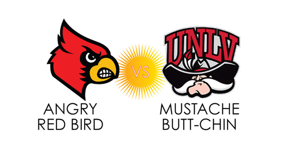
Alright, so, for years now, we’ve been hearing about this March Madness, as it’s called. Being avid fans of NOT being fans of basketball, we never caught it.


A poster by Max Erdenberger of the Portland, Oregon-based advertising agency, Wieden + Kennedy has alreday raised nearly $15,000 towards the relief effort in Japan. 100% of the proceeds go to The Red Cross. Visit W+K’s page to donate and receive the finely made screenprinted poster on 80# cover stock or you can give directly to here as well.

What to do when you’re an independent, self-sustaining, Brooklyn-based graphic design studio that wants to keep up artsy, edgy appearances but you’ve only got a pretty un-arty, very un-edgy World Wildlife Fund Giant Pandas 2011 calendar in the house?
That’s right—Use your caption balloon sticky notes to make those endangered pandas say funny stuff every month. We thus give—apologetically belatedly—March’s Pin-Up Pandas. We’ll call them Javier and Fredo. You’re welcome.


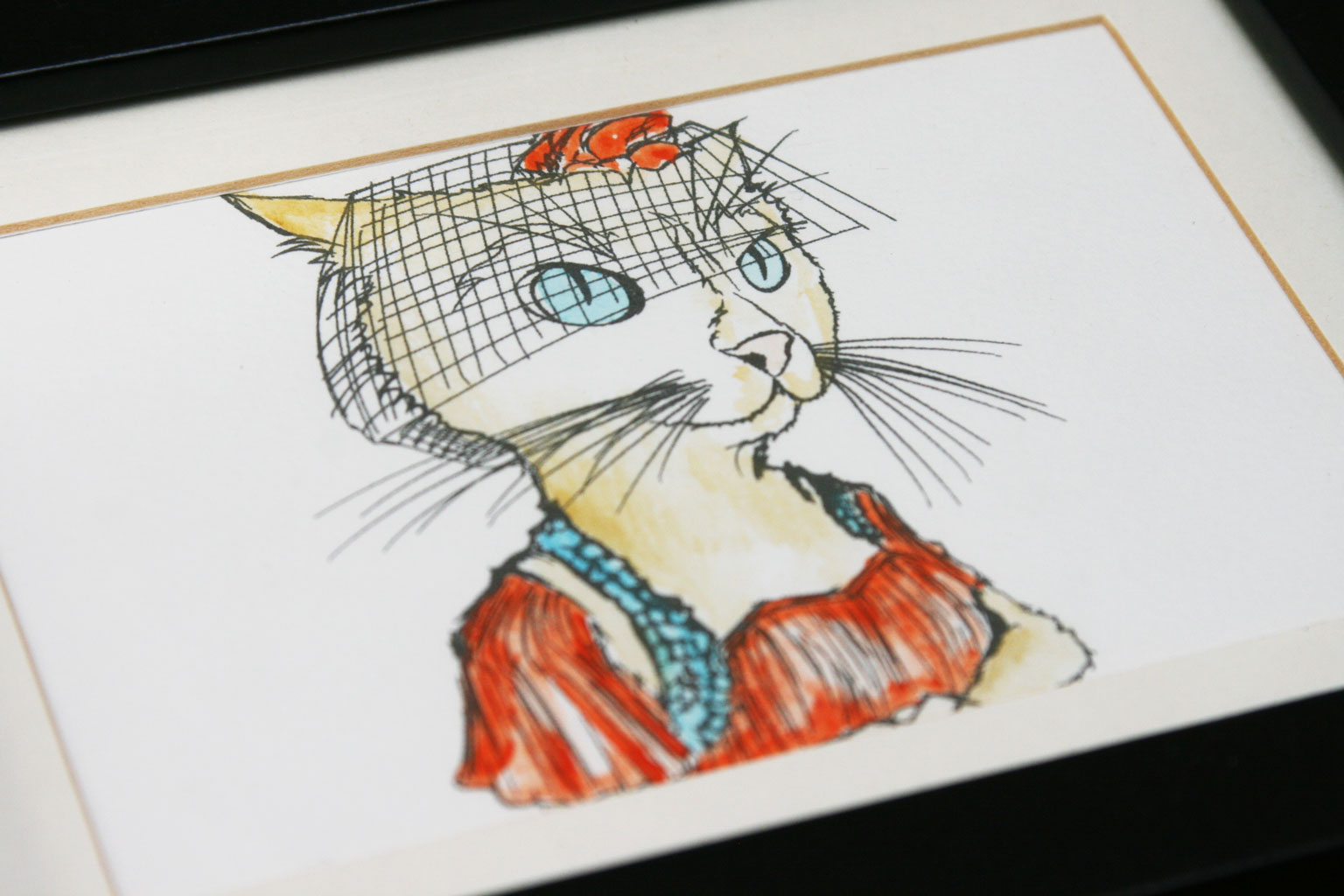
Design flotsam, jetsam.


Seeking: 1br – Cozy. Great light. Privacy, drafts non-issues.
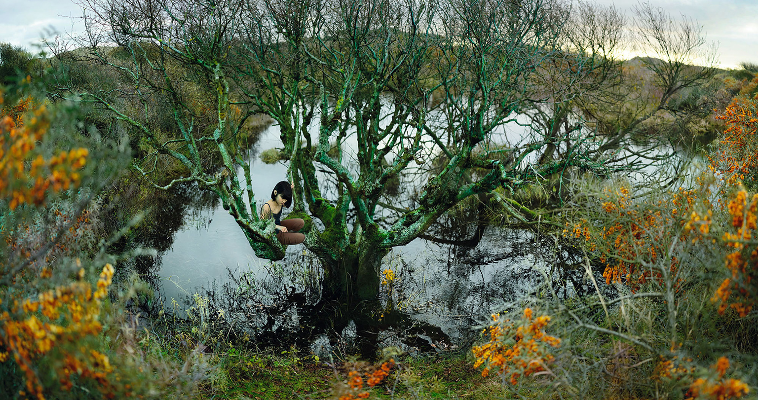
Seriously, I want to live in this house. Wouldn’t you know it—New York City artist, Tom Fruin built it in Copenhagen, of all places. You know. The sixth borough.
The piece, titled Kolonihavehus—literally “allotment” in Danish, referring to small garden plots and their sheds—sits in the plaza of the Royal Library in Copenhagen and is made of metal, paint, and thousands of pieces of reclaimed plexiglass.
Purdy.


We know. Valentine’s Day—yet ANOTHER holiday that’s been co-opted by commerce and, thus, has lost it’s proverbial soul, watered down and reduced to the meaningless buying of terribly vapid cards, heart-shaped boxes of mass-produced chocolates, and cookie-cutter jewelry (“Oh, he went to Jared’s…”). And don’t you even get us STARTED on prix fixe dinners, man.
Don’t get me wrong, we’re not the don’t-invite-them-to-the-party types that’ll talk your ear off about how, since you’re ordering Chilean Sea Bass, you’re effectively putting a choke-hold on your unborn baby or anything like that. On the contrary—we spend much of our time making fun of those types. I mean, how many people do you know that went vegetarian or stopped going to the circus because they were yelled at or guilted into it by the higher-than-thous? Not many, and there’s good reason for it.
But I digress, our point is, yes, Valentine’s Day could very easily be viewed in a realistically negative light. Why do you need Hallmark to tell you that you should do something for someone you love? You don’t. But, that said, I personally love an excuse for any sort of celebration. There are far, far, far too many moments in life that genuinely call for remorse or sorrow or hard work to make things better, so, in my mind, I will take any and every opportunity to celebrate a damned thing. Even if that damned thing has a copyright mark by its title. Thus my penchant for drinking heavily and singing Irish folk songs in March and my strong desire to smell a pine tree indoors and give prettily wrapped gifts in December and my unwavering habit of inviting far too many friends over to eat far too much food in November. So it comes as no surprise, to me at least, that I very unashamedly feel the need to celebrate my love for my dear wife February 14th, despite the fact that I know little to nothing about this St. Valentine or his supposed sweet tooth. Does that mean I don’t want to celebrate said love every other day? No. But, on the 14th, I get a free pass to go a little overboard, and I like that.
 To that end, I have a suggestion for anyone reading who may feel a similar need to, say, buy jewelry or some such pretty thing for a loved one—check out Falling Whistles. Because, in this case, you have the opportunity to pair your desire for gift-giving with your desire to do some good in the world—100% of the proceeds from your purchase of a snazy, cool, and unique Falling Whistles necklace or any other merchandise will be used to restore the lives of war-affected kids in Congo through rehabilitation programs and stateside advocacy. If you don’t know what’s going on Congo, don’t feel bad—it’s woefully underreported here in the US. We were recently exposed to the conflict there and just how terrible and wide-reaching it is through some educational work on conflict-related sexual violence for UNIFEM and simply couldn’t ignore what we learned. We strongly urge you to check out FW’s site because they put everything into context and explain the situation much more adequately than we could. In short, though, it’s a living hell on earth for the people who live there and stands as one of the largest and deadliest wars since World War II. And the good people at FW, who have been there and seen this first-hand, are trying to do something about it. Of course, there are many, many worthy organizations that have been doing good work there for years, but we feel the need to call out Falling Whistles. They’ve created another access point for people to learn about the tragedy going on there and exposed many who may have never heard a word about it to this cause.
Each whistle comes with a very nicely done little ‘zine that explains the story behind the group (why a whistle, for instance) and what’s going on in Congo which, yes, is a very sad but still heart-warming read. And each whistle can be worn with pride, acting less as a totem of ‘hey, look, I care about this thing’ and more as a sign of protest—’hey, I learned about this thing and I won’t ignore it.’ So, if you’re looking for that perfect gift, fuck Jared. Go with this instead.

the moon this morning was amazing
hanging low in the red sky
behind crossed bars and stilled cables
of cranes in shipyards blocks but worlds away
with no camera
i try in vain to capture this with words
pull it down with spines and stems and serifs
wrap it tight
hold it close
breathe it in
but pictures can prove as weak as words
thin-barred prisons for moments that capture me
old women in the subway
detritus on the street
steeples in the skyline
all ask me
where is my god
there is my god
in the rounded down stone that marches around us
in the deadened cranes and failed words and lost photographs
in the quiet of brooklyn at 6AM
in the beauty of the ordinary
there is my god
there is my god

Nikki McClure has held a place in our hearts for a long, long time. First, in college, as an independent musician, then, later, as one of favorite visual artists, taking single sheets of paper and carving into them a detailed, whimsical world of beauty and grace. So, needless to say, we were beyond excited and unbelievably humbled when she agreed to do an interview with us. Below, we talk about her papercutting process, misheard lyrics, and, of course, crows. All images © Nikki McClure (obvs).
So, for anyone who doesn’t already know your work, can you briefly describe what you do and how you do it?
Nikki McClure (NM): I cut images from paper using an x-acto knife.
KoR: Well, THAT’S a bit of an understatement. How long does an average(-ish) paper cut take you?
NM: I usually give myself a week, but sometimes it takes longer. The week timeline is usually a combo or procrastination and scheduling.
KoR: And do you always work from a single sheet of paper? I feel like that’s understandably one of the most impressive parts of your process to us.
NM: Yes. But sometimes there are separate pieces, but that’s very rare. I like to keep it all connected—a visible example of interdependence.
KoR: So there’s an artistic significance to the process or is it mostly a structural thing?
NM: Yes and yes. It started out as structural, a game, a challenge—the set of rules that I operated under—like math. But the artistic significance has been revealed slowly. We are all connected.
KoR: Nice. Are they always in black only originally?
NM: Mostly. Sometimes I will add an additional color, but it has to be the right color and the right paper. I like black and white.
KoR: It is classy. So, then with some of the prints based on your paper cuts, you add color, correct? Is that a silkscreen thing or a computer thing?
NM: It’s a computer thing. The images that most people see of my work are the graphic versions of my art. I sit in my friend’s basement and work on it directing him over his shoulder, or I scan and send it and we do it all via email. Hands-off.
KoR: We actually have a little old apple book that looks like it was colored in with red crayon. Guess that doesn’t happen much anymore eh?

NM: Ah, hands-on. Yeah…I have tied a lot of ribbons, punched a lot of holes, colored in a lot of red apples….that book has my 1st papercut as the illustration on the first page. It will be reprinted in 2012 by Abrams. No hand coloring this time.
KoR: I should hope not. So, do you ever get near the end of a piece and totally, say, take out a tree that supports the whole thing and have to ditch it all?
NM: No. Usually I mess it up earlier than that! Every piece has mistakes. None are perfect. I usually make do…or even better, believe that it is doomed and then I just keep going liberated from the fear that I will “mess it up”. It is already messed up and now I am free to try new things since I can’t mess it up more!
KoR: Very Zen. So, how did you get into this very specific realm of art? Were you ever into traditional Scherenschnitte?
NM: I had a period of folded scissor-cutting but it was mostly Valentines. I started with technical pen and ink, moved to scratchboard, then linoleum, then papercutting. Each step was consciously trying to move away from a technical tendency in drawing. I wanted to make mistakes. I wanted to make it not be perfect. Drawing with a knife is my therapy.
KoR: Certainly one of the more constructive ways to express yourself with a knife…. It seems like the subject matter in your art has been veering more and more toward the natural world and ‘simple’ living—farming, manual labor, sewing, canning, birds in trees. Is that just a reflection of your day-to-day life or should we pull more meaning from the subjects?
NM: I make pictures about my life. So yes, it is a reflection of that living…yet I also make pictures based on a broader community-based memory. I concentrate on evoking memory, from last week to ten thousand years ago—things that humans do. Positive things that humans do, I should add. I focus on our strengths: Hands, tools, dreams. We need to remember what we are fully capable of. It is not shopping or typing at a computer (I am making chicken soup and just revived the fire during this interview).
KoR: About all I can handle is coffee-drinking while I type. And even that’s a little dicey. So, for both Katie and I, much of our development—artistically, morally, educationally—took place when we were in college together in the early and mid-Nineties and we inundated ourselves with the Riot Grrrl and new new punk movements. So we’re familiar with you as an artist in two ways—first, in your work with K Records, Kill Rock Stars, and your own, edgy vocal-centric music; then only later did we come to know your visual work. While we’re big fans of both of these artists, it does seem like a big gap to bridge in terms of style and subject matter. Did one realm of work lead to the other at all?
NM: It is still the same me! The music definitely gave my voice confidence but it was nicer to just stay home and make a book that one person WANTS to read—maybe with a child in their lap—as opposed to sleeping on floors and waking up next to a pit bull (“Dont worry, he’s nice!”) and making people listen to me un-miked in a bar when they just want to hang out with their friends without some lady yelling at them (nicely…in a singy-sort of way). There’s less stage fright involved and now I get hotel rooms and 11AM story time tours. But the music was an awakening. Now my voice is refined and printed. No more yelling. Even the words I use are not in your face…but suggestive reminders.
KoR: I was personally always a huge fan of the song, “Omnivore”…though I was constantly singing the words wrong, it turns out.
NM: That is perfect. You made up your own song. I like that my pictures have a very specific memory for me…yet they evoke a different memory to others.
KoR: I don’t know…I think I was singing something like, “Baby I’m on the voor”…. I’m bad with lyrics. So, are you still involved with the Olympia music scene at all or has it all evolved from music into…I don’t know…organic bakeries and local bookstores as its members have grown?
There are bookstores, bakeries, burritos, clothing stores, and cafes that are punk-based ventures. It has been exciting to participate as reader and eater.
KoR: You’ve been somewhat of a keystone seemingly in the Olympia community for years now. How have things changed there?
NM: Ahh…to be a keystone. I have been here a long time! About the same time I had a child (6 years ago), there was a cultural exodus from Olympia to Portland, mainly. I became a hermit in my Mom Cave. BUT, there is still Evergreen State College and there are still young dreamers and makers arriving all the time. A handful stay and CONTRIBUTE!! So that is still the same yet ever evolving.
KoR: Over the years you’ve translated your work into a variety of formats—books, posters, amazing calendars, notepads, shirts…. Any new products in the pipeline we can get excited about? Life-size paper cut sets for the stage? Capes?
NM: Capes??? You may have something there. I am dreaming of large silk-screen duvet covers.
KoR: Those would SO do well. Can we call dibs on a crow one? Now, in closing, and speaking of, we have to ask—what’s with the crow fascination?
NM: There are crows everywhere in Olympia. I keep time by them. They are me.
KoR: Crow clock. Amazing. Why didn’t we think of that?! Alright. Lightening Round. New band/music you’re listening to lately?
NM: Tender Forever.
KoR: Favorite recipe?
NM: Kale salad—massage the kale with salt, add some apple cider vinaigrette, some chopped apple, toasted sunflower seeds, golden raisins.
KoR: Yum. Best place in Olympia?
NM: Home.
KoR: Do they do brunch…? Cat or dog person?
NM: Bird.
KoR: Of course! Favorite piece of your own, ever?
NM: The one I am about to make.
KoR: Nice. Totem animal?
NM: Crow. Duh. Or chicken, according to my son (he gets to be a puma…grrrrr—I mean “cluck!”).
KoR: Favorite area artists that’s not you?
NM: Marilyn Frasca.
KoR: Odd thing not many people know about you?
NM: My ears are lopsided, so I can’t wear sunglasses comfortably.
KoR: Ah. My head’s weirdly thin, so I have to wear, like, designer kids’ sunglasses. Boooo. Finally…can we be crow buddies?
NM: Cawww!