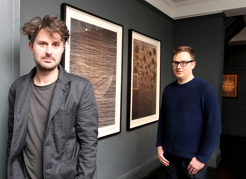
British multidisciplinary design duo Kai + Sunny have been creating wildly intricate, elegant, beautiful works for the commercial + fine arts world for more than a decade now. From book covers for Cloud Atlas author David Mitchell to work with Alexander McQueen to global advertising campaigns for Adobe + Apple, whether you know their names or not, you likely know their work. This weekend, the two are celebrating their very first solo show on the West Coast at LA’s Subliminal Projects. We got a chance to speak with Kai (left, above) about the origin of the duo, how their style developed, and their new collaboration with famed street artist Shepard Fairey.
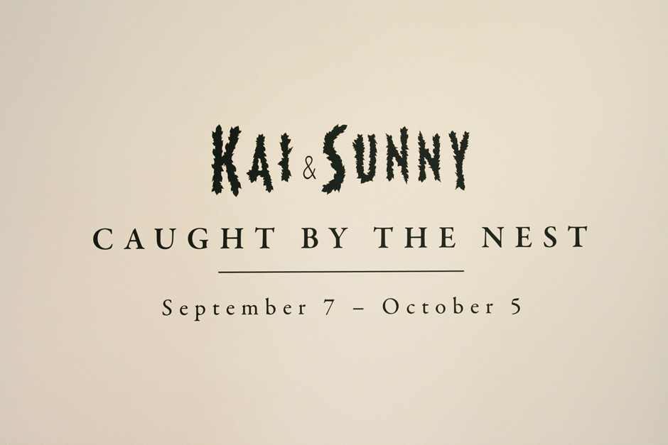
Kindness of Ravens: Can you tell us a little about “Caught By The Nest”, your show at Subliminal Projects? We hear it’s largely inspired by the illustration work you did for Naoki Higashida’s The Reason I Jump?
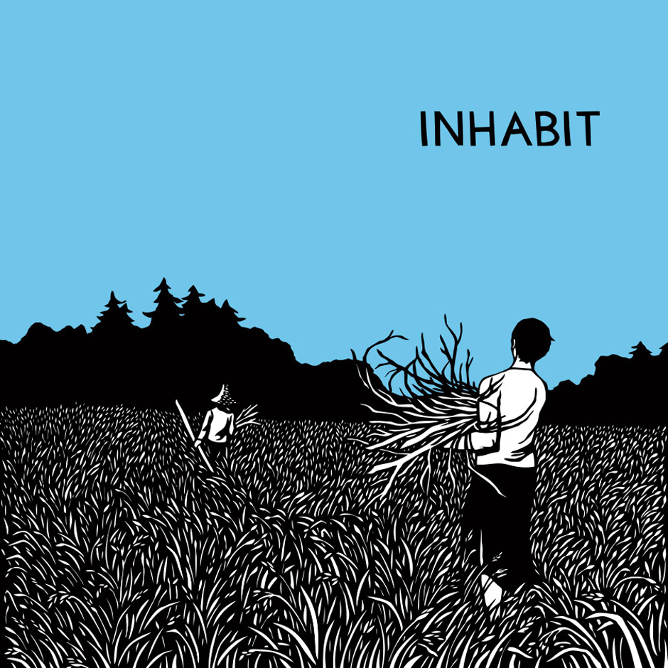
Kai Clements: “Caught By The Nest” is the first solo show we have done on the West Coast. It consists of 24 pieces, a mural, a box set, short animation, and a mix CD along with a 3D piece. The idea for the show came about whilst working on the book The Reason I Jump. The book was very moving and we could make parallels with the text and what we are trying to say through our work.
Right, I read that the protagonist in The Reason I Jump is a child with autism who turns to nature as a sort of refuge or calming force, which seems to me like a nice parallel to your work—you both so often incorporate the natural world in your pieces to inspire feelings in your audience. It’s interesting to me that your work, which is so geometrically based and full of so many ‘unnatural’ manifestations, so often builds it’s pieces off of the chaotic, organic, unpredictable natural world. Can you speak to what inspires your pieces and how they come about, both inspirationally and technically?
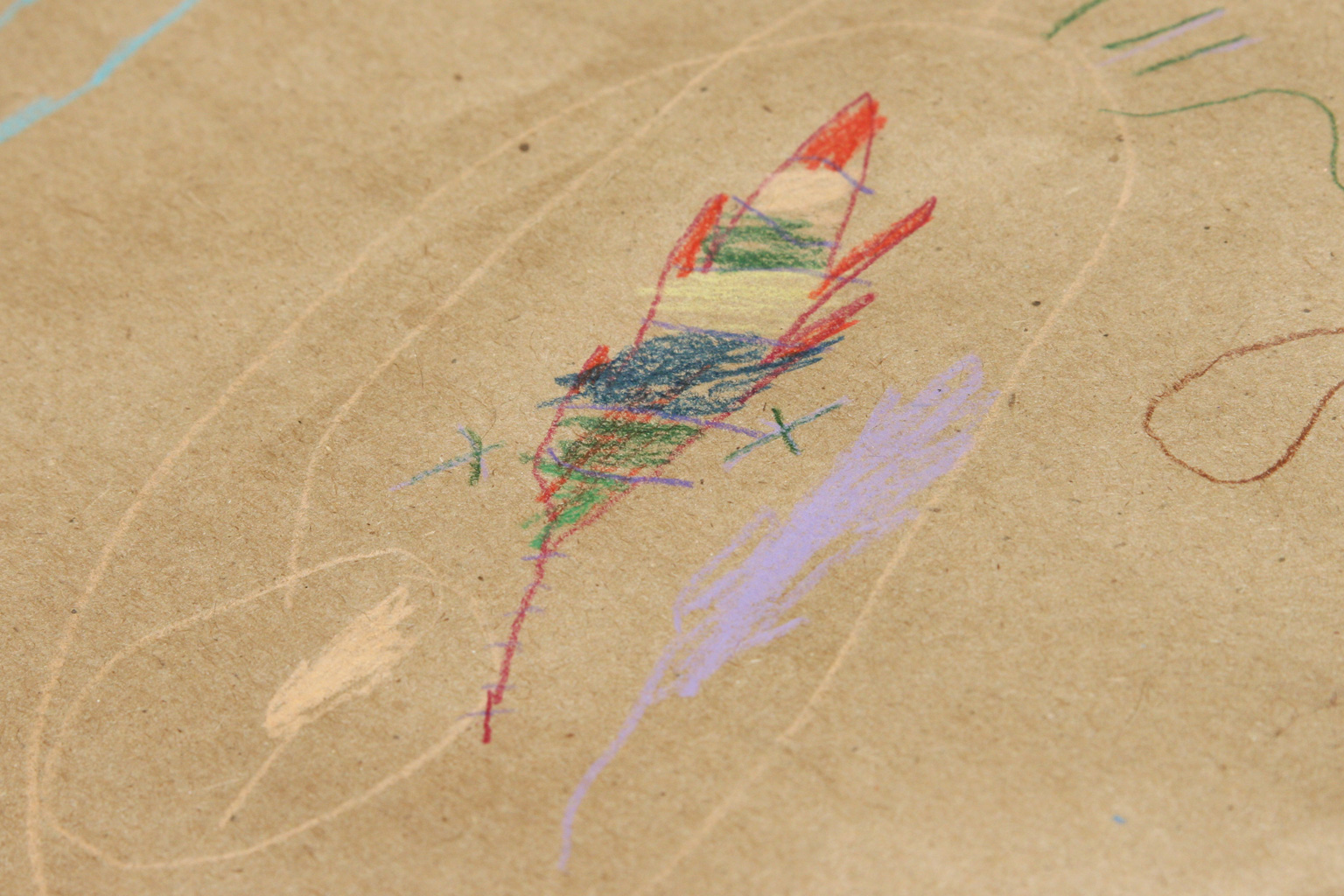
We like to use simple shapes in our work and build these up to something much more complex. We do this in much the same way that geometry does in nature; how a simple shape like a single leaf or hexagonal wax cell from a honey cone is the bases for a much more complex structure.
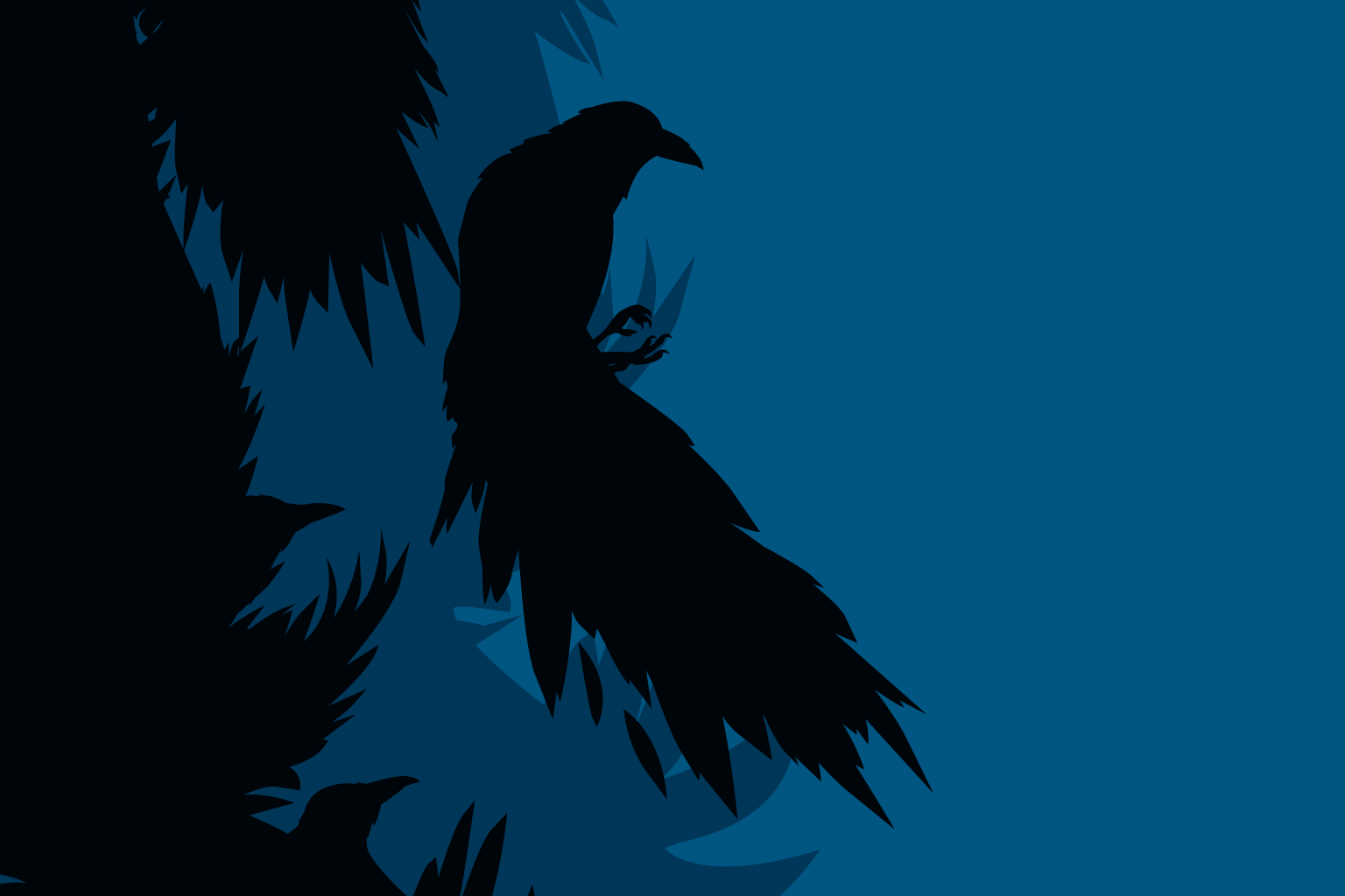
We use nature in our work to connect with people, provoking thoughts and memories. Nature is the basis of our work but it goes deeper than this—we use it as a metaphor for other feelings. We like to explore double meanings, simultaneously balancing the serene with the troubled. Our work has hints of subversion and deception within seemingly innocent symbols and forms.
Yeah, how is that done, exactly?
Technically we first draw our shapes and then bring them into the computer to refine. The end stage is a silkscreen print or letter-press print on various surfaces.
So digital/high-tech to traditional/lo-tech. Excellent. It seems to me that much of your non-commercial work is largely colorless or only brings in one or two hues. Is that so that you can focus your viewer more on shapes, forms, and movement in your pieces?
For us, our pieces sit better with less color and, yes, you’re right—the focus is then on the shapes, form, and movement. However we like color and we use it in our commercial work. I’m sure we will do a color piece one day.
Your work is so intricate—I’m sure it varies from piece-to-piece, but can you give us an idea of how long it takes to create some of them? The cover for David MItchell’s Cloud Atlas, for instance?
The cover for Cloud Atlas came together very quickly and was the start of what we do today. Cloud Atlas gave Sunny and I recognition in the public eye when we designed it back in 2004. Since then, we have been refining our craft. Our work feels much more delicate in its approach today. Our art pieces can take up to a month from concept to finished piece before we are happy with them but sometimes it comes together more quickly.
Are there particular designers or fine artists who you feel have informed your work?
There are many artists and designers that have informed our work. I started my career at Mo Wax, a record label ran by James Lavelle. I worked under Ben Drury as a record sleeve designer. He had a lot of influence on me in the early days. Sunny and I have been inspired by the work of William Morris. We love the work of Barbara Hepworth, Yayoi Kusama—the list could go on and on.
I’m sure. We have friends who are authors who’ve complained to us in the past about how little control they have over the design of their book covers, saying that the publisher so often has a firm concept of what will and won’t sell books. Your all’s publishing work is so creative and very indicative of your other work. How did you all first get involved with book design? Was it through a particular publisher or author?
The first book cover we designed was Cloud Atlas with Hodder & Stoughton in the UK. Before that we were designing for record labels and fashion brands. I think because the book did so well, the publishers had confidence in us from that point on. Most of the covers we have designed we have had free rein.
That’s great. So, I heard that David Mitchell actually wrote a short story in response to your pieces in the show too.
This is correct. We asked David if he would be interested and he was really excited about it. We sent him the works from the show. We told him we were inspired by the book The Reason I Jump, which David translated. The story he wrote for us which is called “Lots Of Bits Of Star” is fantastic—it will come in a letterpress box set and a much larger silkscreen version will be available at the show.
Can’t wait to see it. What can you tell us about the collaboration you’re doing with Shepard Fairey for the show? We’ve heard very little about it leading up to the show.
The collaborative print is a version of one of Shepard’s Mandala pieces. We both felt the combination between our style and Shepard’s shape would be a great pairing. We are really pleased with the results.
It looks awesome from the shots you sent us. We’ve worked almost exclusively as a traditional, commercial, client-based design studio for years now, but, clearly, some of your most exciting work is in collaborations and in the fine art realm. What came first for you all?
Sunny and I first worked as a design studio and then started a fashion Label called Call Of The Wild. We saw the label as an art-based one and would present our collections with in-store installations. We did this at Liberty, Selfridges in London and Collette in Paris. We did our fist complete show with the fashion label in Shoreditch, London at Jaguar Shoes back in 2004. Our first solo art show under Kai and Sunny without the label was in 2007 at Stolen Space gallery in London.
Very cool. And now you’re here in the US. I wanted to ask—we’re huge fans of much of Alexander McQueen‘s work—how did that collaboration come about?
We are too! This was a great project and something we are very proud of. We were contacted by the art director and the project went from there.
Do you have any other exciting projects coming up in the near future that you can speak to?
We have a few projects lined up when we get back but can’t talk about them till they actually happen.
Fair enough. Is your relationship with Subliminal Projects a new one?
Yes this is the first show we have done with Subliminal. I met Shepard at Art Basel in Miami at the end of last year and he invited us to show then.
Synergy! Do you have any other plans while you’re here in LA? Maybe hit the beaches? Tool around Rodeo Drive à la Pretty Woman?
I’m here for just over three weeks. We arrived on the 20th of August. My wife is from here, so we’re seeing lots of family. My two small boys are with us too. Lots of family time and meeting old friends. The trip has been great so far! Universal Studios was amazing!
Ah! We have yet to go. Adding it to the list. Thanks so much and looking forward to the opening.
Angelenos + others in the area—Kai + Sunny: Caught by the Nest runs from September 7 to October 5 at Subliminal Projects – 1331 W. Sunset Blvd, Los Angeles. They’ll be kicking things off with an opening reception Saturday night from 8-11PM.
Below:
Section: Smashed Dandy, 2013 (hand-pulled 2 color screen print);
Section: Lots Of Bit Of Star – Copper, 2013 (hand-pulled 1 color screen print);
Section: Lots Of Bit Of Star, 2013 (hand-pulled 2 color screen print);
Section: Migration South, 2013 (hand-pulled 2 color screen print);Section: Moving Dune, 2013 (hand-pulled 2 color screen print);
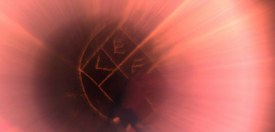
Section: Shepard Fairey x Kai & Sunny, show print, 2013 (hand-pulled 2 color screen print);
Section: Wild Flower, 2012 (hand-pulled 2 color screen print);
Section: Sycamore Seed, 2012 (hand-pulled 2 color screen print);
Section: Signed/Stamped Shepard Fairey x Kai & Sunny, show print, 2013 (hand-pulled 2 color screen print);
Section: Shepard Fairey x Kai & Sunny, show print, 2013 (hand-pulled 2 color screen print);
Kai + Shepard hard at work.