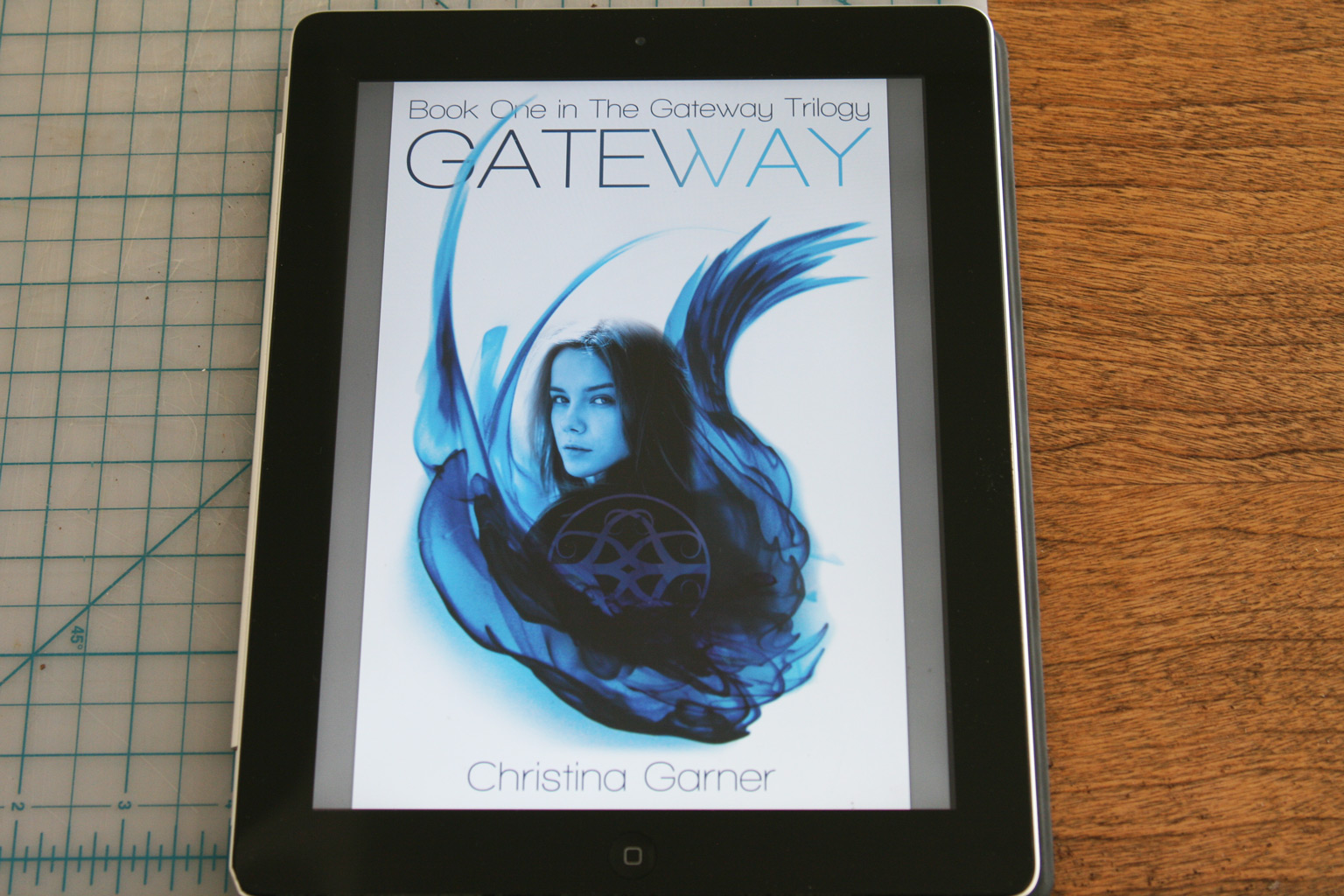
We recently added some new work to our portfolio—book cover designs for Los Angeles author Christina Garner‘s young adult fantasy series, The Gateway Trilogy.
You can read more about the books themselves and see more images of the covers we design in our portfolio, but we wanted to write up a little bit about the process here.
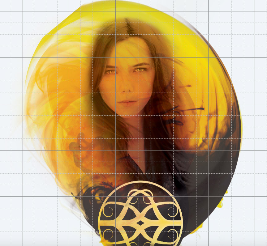
After we worked with Garner to come up with a symbol for the series—something that plays into the plot of the books and needed to stay consistent with existing text—we worked with her to come up with a cohesive look and brand for the whole trilogy. In addition to focusing on the protagonist on the covers, we decided to create imagery that tied into the idea of a portal to another dimension.
To come up with the ethereal, cloud-like forms, we added drops of food coloring into swirling water within a white ramekin, photographing at high speed as the motion of the water moved the colors into swirling forms. We then chose some of the better shots, brightened the images, and selectively omitted the walls of the ramekin while brightening the overall white in the image. We then integrated the Gateway symbol with a slightly altered image of the protagonist (the model original had blonde hair) and chose color palettes for each of the three books that make up the trilogy.