For anyone who doesn’t already know, Pantone—”the global authority on color and provider of professional color standards”—has been choosing colors of the year since 2000, the intention being to both predict and guide trends in the coming year.
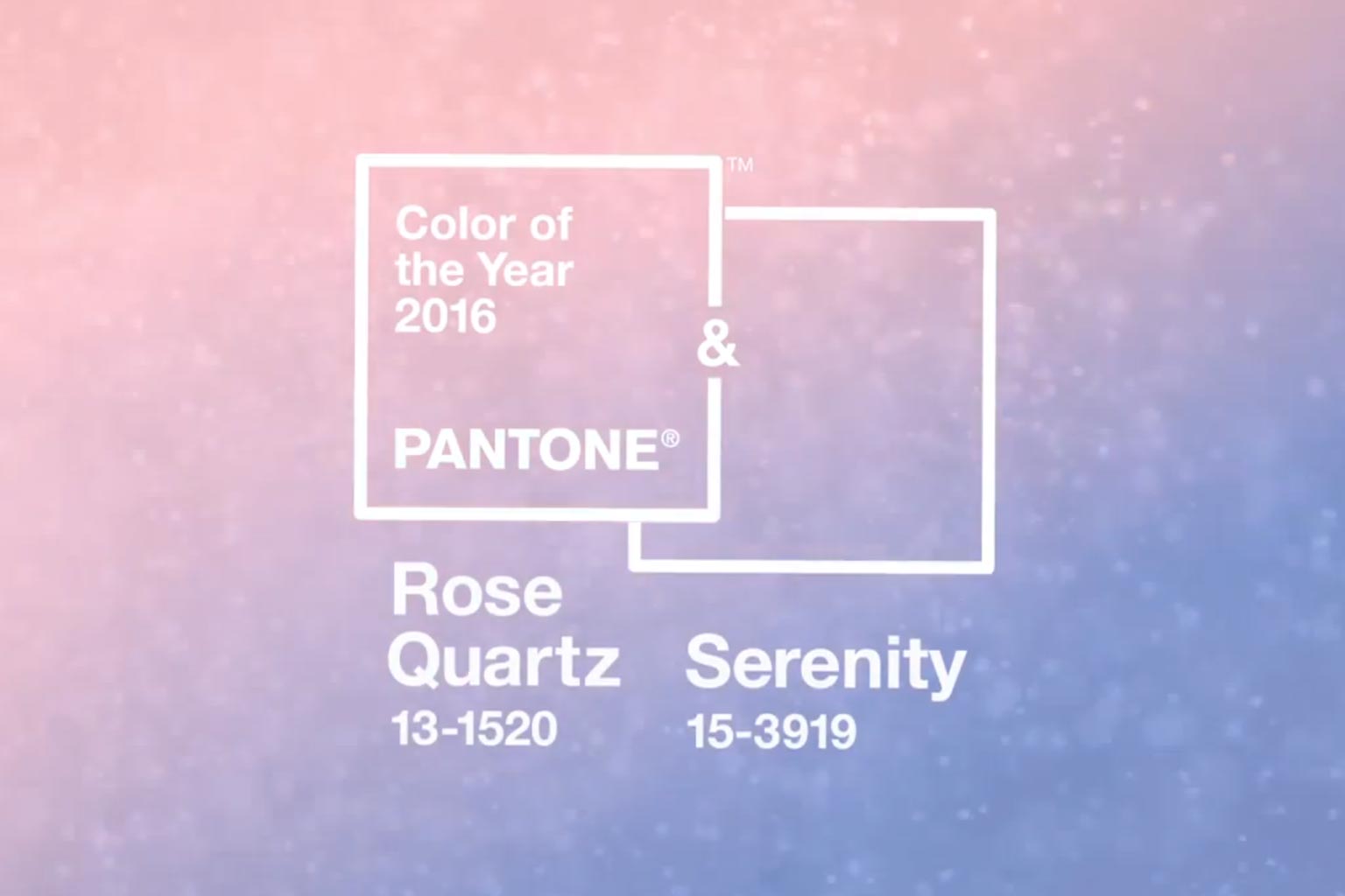
Today, Pantone announced the 2016 colors, marking the first time ever that the color experts have chosen two colors to brand a single year. It also denotes what may be a much more socially conscious, politically aware decision-making process for that choice. Or good PR. Or both.
According to Pantone, the two new colors—Rose Quartz + Serenity—”demonstrate an inherent balance between a warmer embracing rose tone and the cooler tranquil blue, reflecting connection and wellness as well as a soothing sense of order and peace.”
They continue, via press release:
“The prevalent combination of Rose Quartz and Serenity also challenges traditional perceptions of color association. In many parts of the world we are experiencing a gender blur as it relates to fashion, which has in turn impacted color trends throughout all other areas of design. This more unilateral approach to color is coinciding with societal movements toward gender equality and fluidity, the consumer’s increased comfort with using color as a form of expression, a generation that has less concern about being typecast or judged and an open exchange of digital information that has opened our eyes to different approaches to color usage.”
Though the tone and verbiage of the announcement might verge on pretentious over-importance and the video that accompany it (below) strike me as very Scientology (or at least yoga retreat-y)…I like the idea and welcome some serenity and peace in the com in year, especially after so much sudden violence close to home.
Now to order yet another new set of Pantone books….