Over at our print portfolio, we just added some collateral work we recently created for longtime collaborator, NYC-based creative collective, Pel.
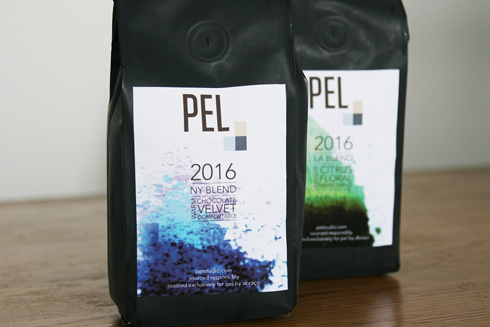
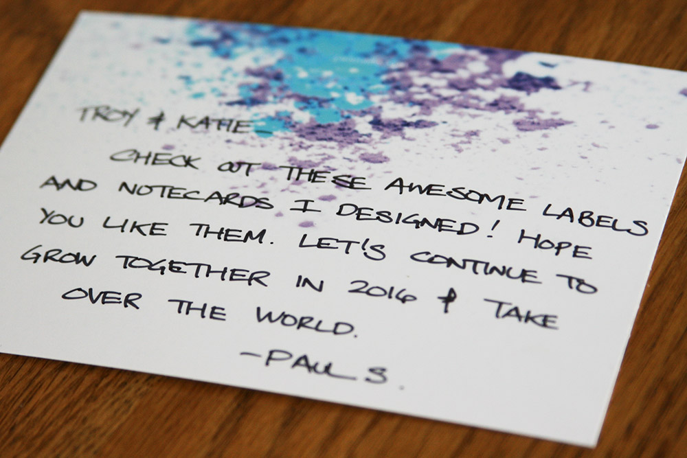
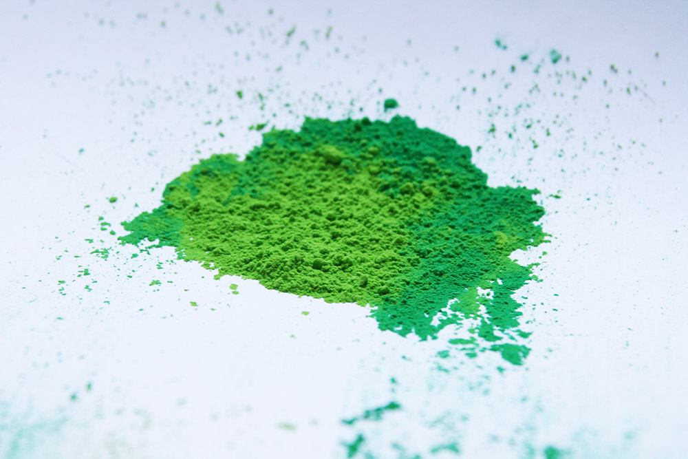
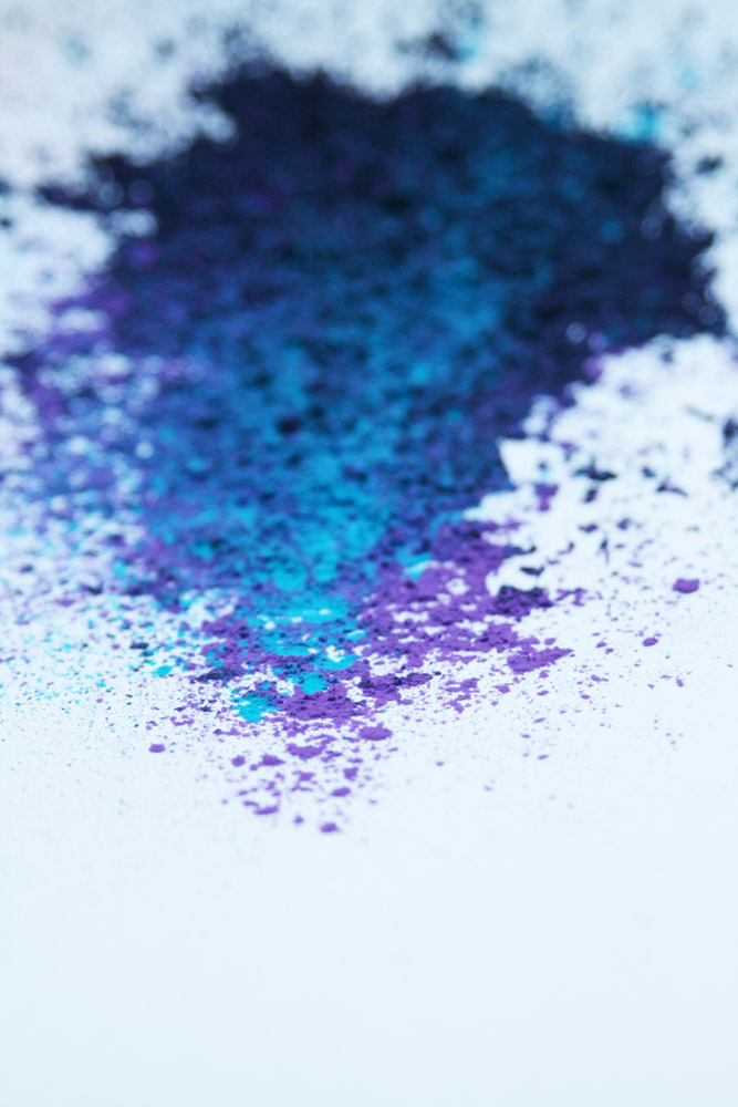
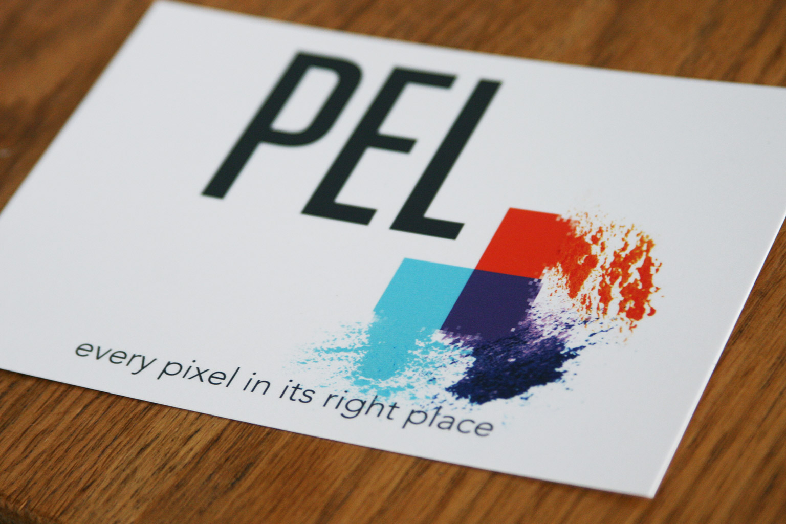
The work covers coffee labels we again did for Pel’s annual caffeinated client gift and some new print notecards. Both designs revolve around an idea we came up with involving brightly colored powder—we wanted to play with the concept of vibrant, real world elements coming together to form and enhance Pel’s existing branding. With the postcard, we accomplished the goal by taking three separate shots from our shoot of the powder and having them come together to form the three blocks or pixels (also known as pels, or Picture Elements), playing with transparency on the blocks to further the impressions that organic is coming together to form the digital.
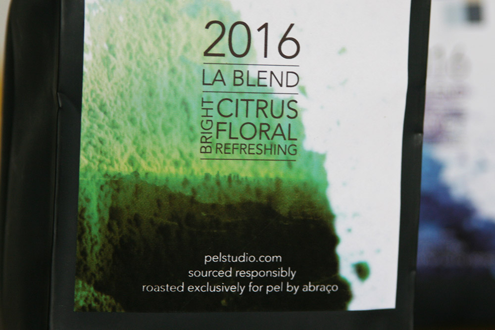
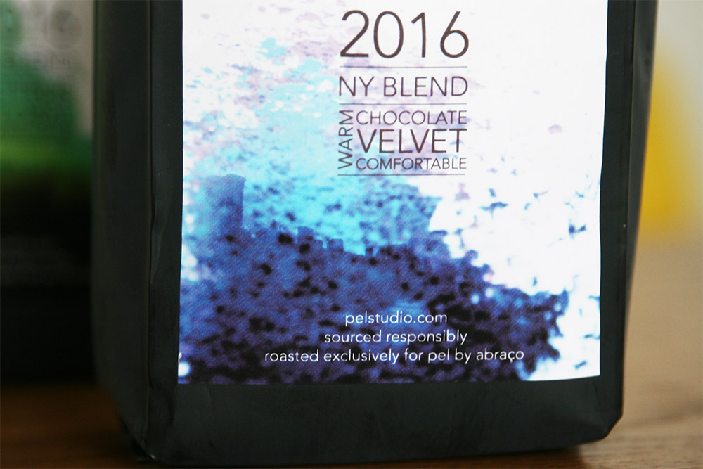
Then, with the coffee labels, we further the concept by subtly bringing in our photography of New York and Los Angeles to tie the coffee blends to the city themes Pel’s principal, Paul Singh, communicated to us in the early stages of conceptualizing the designs.
You can see more work for Pel in our portfolio and then check out our 2014 and 2015 write-ups of each label on these pages.