It’s that time of year again—when normal, relatively sane sports fans go…MAAAAAAAAAD.
For us—long-time not-basketball fans—it should mean missing out on all this fevered bracket work and yelling at the TV. But we very much dislike being left out. So what’s a graphic designer with little to no knowledge on this strange “hand-soccer” game to do? Find something else to scrutinize, obviously; namely, their logos.
We first brought you our Logo March Madness in 2011, when the Longhorns took it all (solid logo). Then, again, last year, when our very own alma mater and proud possessor of one of the worst logos of all time, James Madison, made it into the playoffs for the briefest of moments.
So, for the third year, and just in the nick of time, we give you raven + crow studio’s MARCH MADNESS VISUAL BRANDING BRACKETS!!! Click the brackets to the right to see a larger version.
As with years past, our judgments on visual branding and team logos have absolutely no bearing whatsoever on actual games…but we do wish the very best to teams choosing solid branding over, say, weird contorted animals and mid-century script fonts.
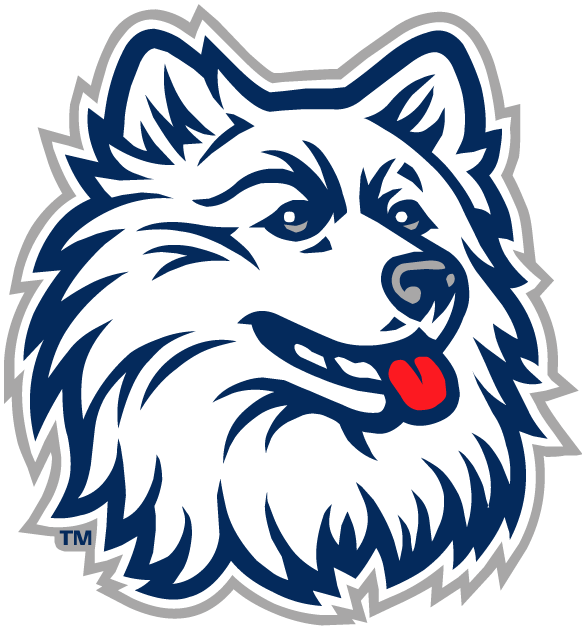 First off, we tip our hats to the many schools with newly redesign logos, first and foremost to VCU, who literally debuted a solid new mark days ago, incorporating their mascot (the ram) in a nice, subtle way in the V of the logotype. Also redesigned last year, UCONN’s logo which used to look very much like a dog our dog would like to hump (to the right)—such flowing locks; and that tongue! The San Diego State Aztecs ditched the old-school gold outline and went with a more up-to-date, flat design and a slightly more square layout—we highly approve the more useable logo. And the Creighton Blue Jays—awesome. That bird looks badass. And he used to look like an angry nerd.
So, in most cases, our take on sports logos is that they tend to be too sports logo—too much angry animal; too ‘shiny’; too EXTREME. Beyond that, our thoughts on what make a good sports brand mirror what we think makes for a good brand for anyone—keep it simple, don’t try to jam too many ideas or too much text in there, be unique, and be compelling. One exception that made it further than it likely should have—the extra-EXTREME New Mexico Lobos. They just kept going up against nearly equally bad logos.
So, after an initial bout with—what, an HP Lovecraft-esque rooster?—our winner, the University of Virginia, proves that a clean, simple logo with both a refinement that points back to their scholarly origins and a sports-appropriate level of edginess is a perfect fit for a university athletic team. Well-done, UVA.
Let us know what you think on our Facebook page, where we’ve posted the brackets as well. And good luck, everyone!