December 22, 2015
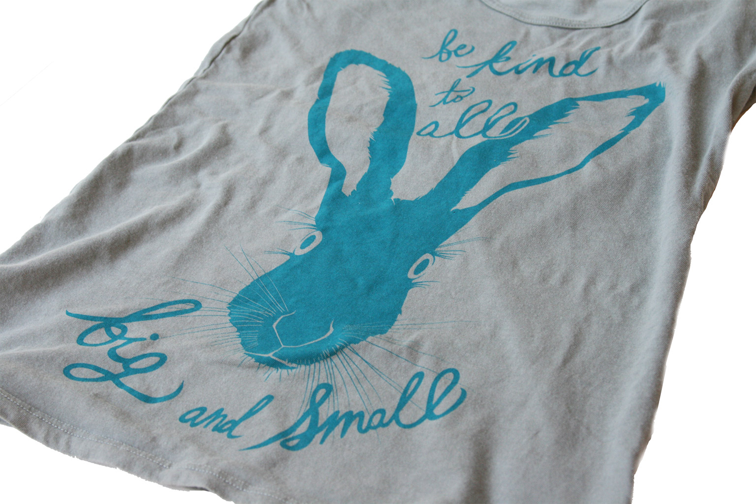
Came across this detail of the watercolor work we did for Feminists for Animal Rights‘ re-branding + site design. We’ve found more and more than the mix of organic, natural elements in more refined, classically designed formats draws our eyes and defines a lot of the design and art direction we provide of late. This is a good example of just that.
You can read the full writeup of FAR project in our design portfolio.


