March 17, 2011
Alright, so, for years now, we’ve been hearing about this March Madness, as it’s called. Being avid fans of NOT being fans of basketball, we never caught it.
“Basketball? Whatevs.” is essentially how we felt. We had shirts made.
But then we heard about these brackets, and, we have to admit—we LOVE an excuse to throw yourself into bizarrely complicated charts that figure stats, emotional connection, and loads of guesswork. So we suddenly felt kinda left out. Because, reader, we do not know a THING about basketball. I think there’s a hoop—that I’ve got—and, seemingly, teams run back and forth across a super-shiny court, putting the ball into the hoop until one team misses, and then the team that didn’t miss wins after a bunch more running usually.
So, no, we know little to nothing about the sport of basketball…but we DO know logos. The solution to our left out blues? We’ll start our OWN awesome bracket based entirely on the strength of each team’s logo. Nothing else. Not even the tiniest inkling of something we may have heard in passing as we changed the channel just a little too late as the news went to sports. Just the logo—how well does it communicate the team’s desired toughness and/or agility, does the simplicity of that mark give it strength or make me yawn, is that tiger jumping out to maul me or hug me? So that’s just what did, reader. I give you, the raven + crow endorsed March Madness bracket. Of logos.
Since some of it may require a little explanation, I feel compelled to pass on a little bit of our deliberation process as well. In most cases, cat logos won, because cats are cool. We realize that’s a bit of a flaw in our judgement. But we feel it course corrected in-process. Also, there are three teams whose logos are just a W. That’s lame.
First, we tackled the east, starting close to home. Awesome Bird head vs. Ohio State was easy.
Katie: I like that bird’s plumage.
Troy: Yeah, Ohio State doesn’t have a chance.
Villanova against George Mason was another easy one. Shooting stars? What is it, prom?
Katie didn’t like the odd, angular juxtaposition of West Virginia’s logo and it just felt dated to us. Plus Clemson, cats, done.
The next ones confounded us a bit.
T: Hm, the playoffs could use a little more animal print.
K: Wait, who is that?
T: Let’s see…PRINCETON! What, is Harvard leopard print? That’d rule.
We liked the simplicity of impact provided by Xavier. Plus, the name combined with the look of the mark was super-X-Men-y, which I liked. Which made Katie want to go with Syracuse, just because she wanted to see an extra-small competition.
Washington vs. University of Georgia gave us a little trouble, but we ended up going with UGA, despite the fact that they look very Green Bay, which caused some concerns with branding confusion. Then, Long Island University didn’t have a chance, even in our book. Really, LIU? The ONLY logo without a transparent background?
Now in the west, Duke’s mark was too classic and well-done to pass over and Katie didn’t like the look of Hampton’s disturbingly angular pirate. Michigan vs. Tennessee?
K: Michigan. I like their slight flair against the boring T. At least they put some effort into it.
Cat won again Arizona (“Hey, our state starts with an A!”). And Oakland’s “fearsome” bear was way too clip-art-y for us to even start to hold its own against the longhorn.
T: It looks like a roller coaster logo or something
Next?
K: Bucknell? And some sort of wolf-dog. Ugh. This one’s tough. I think maybe…Bucknell? If I go with what I said about the clip-art with the bear…but it’s borderline.
T: I just can’t tell what that is with Bucknell. Oh, it’s a bison. It looks like an amoeba or something. And what’s it doing?
K: I think it’s punching. Like fighting. Fighting Bucknells?
T: Alright. We’ll go with Bucknell. Plus that wolf-dog looks totally oblivious.
K: Yeah, that’s more of a show dog.
Penn State was classic AND it had a cat. Sorry, Temple. Then N. Colorado and San Diego?
T: What’s going on with that spearheady team? And what do you think of that bear?
K: i’m not very terrified of him. But i might throw him a bone and go with him. We’re very anti-bear this round. Which is not very like us at all.
T: Alright. On to the south.
Boston U. vs. Kansas.
K: Ugh these guys are so bad. I don’t know. The south seems to be lacking in the cat department.
T: I mean this woodpecker guy, at least he’s sort of jaunty.
K: Mm-hm. I’ll go for him.
T: And Illinois…I’s? versus…Yosemite Sam?
K: Yeah, Illinois. I don’t even know what that guy is.
Next, Richmond against Vanderbilt.
K: Spider.
T: Why?
K: Oh, just a very nice clean design.
T: Agreed. So nothing to do with the fact that it’s richmond.
K: …no.
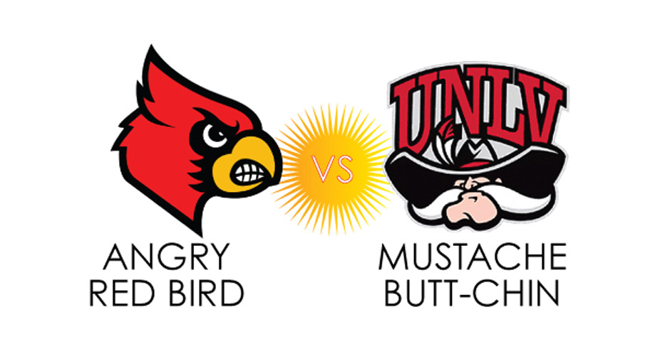
T: Alright. Next…whoa! Check out these mean birds. I wouldn’t go to that game for fear of being beat up by one or both of those birds. It’s tough though. They’re both pretty good.
We went with the symmetrical, bold-faced eagle, lookin’ you right in the eye, all tough as opposed to the “Oh, I’m SOOOOO mad at you,” teeth-gnashing cardinal.
Georgetown vs. VCU.
K: Hm. I like the ram, but i don’t like the placement of ‘VCU RAMS.’ But the G is just boring, so I’m going with the rams, I guess.
T: Nice. Next, a threatening peacock vs. a choo-choo train…. You gotta’ give it to ‘em both for choosing non-traditional subject matter.
K: I think I’m going to go peacock.
T: Why’s that?
K: It’s unnexpected.
T: Yeah, plus you gotta’ be pretty tough if you’re gonna make your mascot a peacock.
Florida State vs. Texas A&M.
K: I think the indian chief.
T: Despite potential race issues?
K: Yeah. It’s simple, I like that it’s contained, it doesn’t look like it’s on the side of a roller coaster.
T: Okay. Plus, is it ATM? TMA? What do i look at first there?
Akron vs. Notre Dame.
K: That antelope or whatever.
T: I think it’s a very fast kangaroo or something.
PITT vs. UNC.
K: PITT. It’s classic, I like that they put it in an arc—you don’t see that much…and i can’t tell what that other thing’s supposed to be.
Old Dominion lion vs. Butler dog.
K: I’m going with team doghead.
T: Classic illustration vs. cartoony. Agreed.
Utah against Kansas.
K: I’m going cathead this time.
T: Cat always wins. Plus, U State? Like, State University? That’s just confusing.
Belmont’s bear won out over Wisconsin’s oddly jaunty W—despite the bear’s cartoon look, we liked that it had some detail. St. John won out over Gonzaga because it at least attempted to be clever with its typography.
Wofford vs. Brigham Young.
T: I think with Urine W vs. Sad Y, Sad Y wins.
K: Sad Y it is. It’s a little bloated too….
T: Cheer up brigham young. It’ll be alright. Then, UCLA is too…
K: Little league.
T: I was going to say Peach Pit After Dark. Next up, Weirdly Sneaky Zorro vs. Gator. Hm. I say let’s go with Mr. Shifty. I wanna’ see that go on just to see what he does. Look at him. He’s totally gonna shiv the ref.
Which brought us to round two and some much quicker action. Paw print won out over animal print. Xavier oversimplified Syracuse. We couldn’t agree on Georgia and UNC, so we flipped a coin. Result: Heads—Fat G. The, we felt like, upon closer inspection, the tiger jumping out form behind the M looked more like he was going to hug you, which is not intimidating, so Texas took him down. Cats generally won out from there, and then, in the southwest, jaunty woodpecker wen ton to live another day as the itsy-bitsy spider inched its way past stoic eagle. The ostentatious glare of St. Pete was too much for the awkward Virginia ram, but it came down another coin flip for potentially offensive native american logo vs. anteroo. Result: My bizarre marsupial mammal won out. Classic bulldogs and Thundercat logos won out form there, and then Sad Y and Trojan Hat beat out Red Jumble of Letters and The Lurker, respectively.
In the end, it came down to a ruthless, wild affair, involving a simple, some might say elegant spider; a determined, but maybe a bit too flashy bird; a strong, silent longhorn bull; and a chubby bulldog. Who doesn’t love a chubby bulldog? Whereas the Longhorns took it in the end against Richmond’s Spiders, we really could have seen it going either way. But the important thing is that those were both strong logos and they came to play—not spell out their state’s name in a playful manner, not just outline the first letter of the name of their school, not stare with disinterest and, I’ll say it, aloofness (looking at you, Connecticut)—they came to play. And they did.
God bless you, Longhorns. God bless you and your orange, orange head.
As a slight postscript, it seems, in the time it’s taken to write this post, that two of our four predictions have come true. Go Stern Eagle and Chubby Bulldog!!!