Here it is, nearly March, and—with everything going on of late—we realize we haven’t yet written up this year’s New Year’s cards.
Since 2005, Katie + I have sent out custom holiday cards or new year’s cards (depending on how festive we where feeling…and scheduling). We started off pretty simple, printing a small run ourselves on our medium format digital printed and cutting + folding ourselves, gradually moving on to more involved designs, like 2006’s squirrel + acorn cards, with hand-cut acorn-shaped openings showing through the design inside the card.
In 2010, we made the move to outsource the production of the cards as our mailing list grew along with our desire for higher quality. We chose to have them printed using a traditional letterpress, which we’d recently moved to using for our wedding invitation work.
Letterpress printing is a type of relief printing—basically creating a surface that presses into the paper or whatever material you’re printing on with ink (or without if you want to create what’s called a blind imprint). It’s the same concept involved in moveable type relief printing presses—the kind originated in the east nearly 1,000 years ago and popularized int he western world by Johannes Gutenberg in the 1400’s; what you’d think of being used for early newspaper printing. Back then, both letters + images had to be made individually out of metal or wood and then arranged by hand. The resulting print—especially on thicker, more impressionable material—is something that differentiates itself from conventional offset or digital printing in both quality of the look and feel.
Today, the concept behind the process is the same, but technology’s made things a lot less arduous. We simply send our design files out to a plate fabricator who uses them to create a flexible relief plate—kind of like a stamp. That plate is then used in a printing press that has paper fed through by a series of rollers.
We had our first letterpress cards printed by a guy in south Brooklyn who used an awesome old, hand-cranked model in a shared space near Bushwick. His quality was superb, but the size and frequency of our orders eventually outgrew his scope, so we moved to press in Ohio recommended by our friend, Jane Buck of the excellent Foxy + Winston.
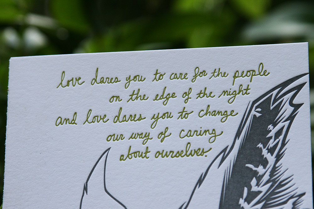
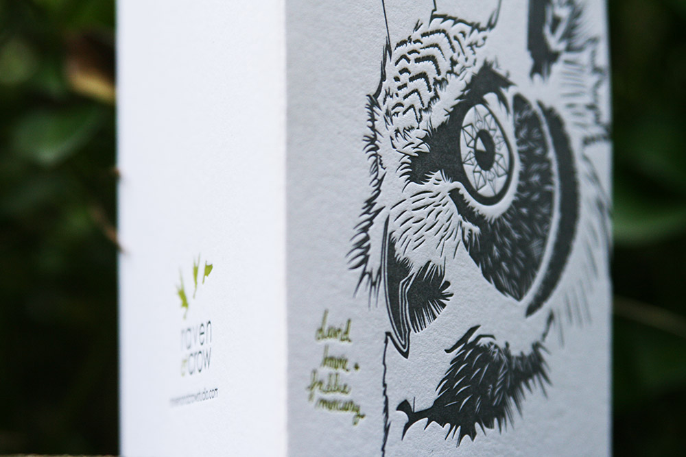
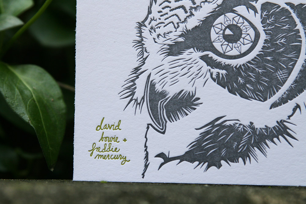
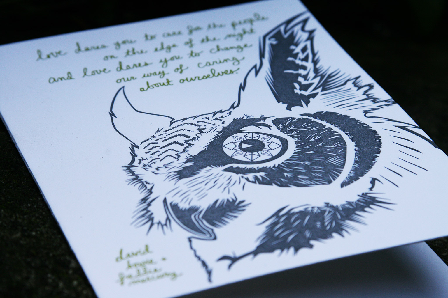
Following in the footsteps of last year’s card—a tribute to the then recently deceased Lou Reed—we again chose to highlight the lyrics to a favorite song of both of ours—”Under Pressure” by David Bowie + Queen. We usually pull imagery from flora and/or fauna with these and, for whatever reason, the elegance in form of a great horned owl seemed to fit this year. Maybe we were subconsciously channeling Bowie’s Goblin King from Labyrinth.
You can see more shots of the card below—see the relief in the paper?
You can see designs form years past in our portfolio.